 |
Castle Paradox
|
| View previous topic :: View next topic |
| So... which looks better? |
| The older one |
|
0% |
[ 0 ] |
| The newer one |
|
71% |
[ 25 ] |
| No opinion |
|
2% |
[ 1 ] |
| I AM OF HAVING DER OPINION OF GREATNESS? TJORD. |
|
22% |
[ 8 ] |
| Actually, I think tha.. *Squish* *THUNK* |
|
2% |
[ 1 ] |
|
| Total Votes : 35 |
|
| Author |
Message |
Fenrir-Lunaris
WUT

Joined: 03 Feb 2003
Posts: 1747
|
 Posted: Sun Feb 22, 2004 6:20 pm Post subject: TSSE Sprite Redesign Posted: Sun Feb 22, 2004 6:20 pm Post subject: TSSE Sprite Redesign |
 |
|
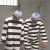
It's come to my attention that my skills as a spritist MIGHT have improved somewhat since I first began work on my current long term game, Timestream Saga Second Edition (TSSE, for short). In order to make it as graphically superior to other OHRRPGCE games (in general) I've decided to 1: Redraw many sprites I've felt were lacking, and 2: Ask the community which they prefer. The old, or the new? Well, here's a glimpse:

Questions and comments are accepted as always. |
|
| Back to top |
|
 |
Squall
is fantastic
Joined: 02 Feb 2003
Posts: 758
Location: Nampa, Idaho
|
| Posted: Sun Feb 22, 2004 6:31 pm Post subject: |
|
|
| The second set looks a lot better, not only because of artistic skill, but because you go for poses that you don't see very often. It gives the character more personality. |
|
| Back to top |
|
|
RedMaverickZero
Three pointed, red disaster!
Halloween 2006 Creativity Winner


Joined: 12 Jul 2003
Posts: 1459
|
| Posted: Sun Feb 22, 2004 6:46 pm Post subject: |
|
|
Fen, don't even worry about our opinions, go with the 2nd ones!!  I can't wait to see Kyle redone! I can't wait to see Kyle redone!
_________________
---------------Projects----
Mr.Triangle's Maze: 70%
Takoyaki Surprise: 70% |
|
| Back to top |
|
|
Aethereal
SHUT UP.
Elite Designer


Joined: 04 Jan 2003
Posts: 928
Location: Gone! I pop in on occasion though.
|
| Posted: Sun Feb 22, 2004 7:05 pm Post subject: |
|
|
It doesn't matter to me, because, quite frankly, I think the time could be better spent improving the gameplay instead of the graphics, because the graphics you have now are quite nice.
_________________
 |
|
| Back to top |
|
|
Iblis
Ghost Cat

Joined: 26 May 2003
Posts: 1233
Location: Your brain
|
| Posted: Sun Feb 22, 2004 7:45 pm Post subject: |
|
|
Yes, the new sprite are much better. They aren't so static. The first set was obviously just copy/pasted into each frame, and although you may have done that with the second set it doesn't look like it as much. Also the brighter hair has a better contrast with the rest of the sprite.
_________________
Locked
OHR Piano |
|
| Back to top |
|
|
Machu
Righter, a person who rights wrongs

Joined: 09 Jul 2003
Posts: 737
|
| Posted: Sun Feb 22, 2004 8:43 pm Post subject: |
|
|
The first sprites are good if you want it to look like a Final Fantasy game. The second set is good if you're trying to be original. Hurray for originality! (and not that Dr. Pepper commercial, mind you)
_________________
| Code: | [*]That's it
[*]I'm done reasoning with you
[*]Starting now, there's going to be a lot less conversation and a lot more killing |
|
|
| Back to top |
|
|
Shadowiii
It's been real.

Joined: 14 Feb 2003
Posts: 2460
|
| Posted: Sun Feb 22, 2004 9:42 pm Post subject: |
|
|
The first one seems more...masculine and less "chibi." The second one is a bit more anime style and seems less buffer, however the pixel work is better and much smoother. The stance is also much better in the second one (compared to the first one, which was basically the stance for everyone in TS)
I like how you replaced the gray shadelines in the first one with a lighter blue, it really adds more feel to the "fur" aspect. Also, the second portret is far superior in terms of quality and it is more interesting, but the face seems a little...distored. That is, it was easy to see the eyes in the first one, while in the second one you...can't really.
But the big things it the difference. The second sprite looks considerably younger (say, older teen vs mid-twenties), so if that is what you wanted, then good job.
Also, would you mind posting a 2x next time? I had to save it on my computer and zoom to get all the details...
_________________
But enough talk, have at you! |
|
| Back to top |
|
|
Me
HI.
Joined: 30 Mar 2003
Posts: 870
Location: MY CUSTOM TITLE CAME BACK
|
| Posted: Sun Feb 22, 2004 10:13 pm Post subject: |
|
|
Number two all the way. I've always disliked one aspect of Fen's otherwise wonderful graphics, and that has consistently been the battle graphics, which have traditionally been static, all seemingly based off of one frame. The new set is more dynamic, and looks like each frame was done individually. Instead of just bashing the enemy over the head with his weapon, Kotaru here actually draws and slashes, as one would with a katana. Excellent second set there.
_________________
UP DOWN UP DOWN LEFT LEFT RIGHT RIGHT A B START |
|
| Back to top |
|
|
Fenrir-Lunaris
WUT
Joined: 03 Feb 2003
Posts: 1747
|
| Posted: Sun Feb 22, 2004 10:14 pm Post subject: |
|
|
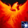
Most people probably recognise this guy by now:
 |
|
| Back to top |
|
|
Shadowiii
It's been real.
Joined: 14 Feb 2003
Posts: 2460
|
| Posted: Sun Feb 22, 2004 10:28 pm Post subject: |
|
|
I don't like the second one much. Thought it isn't as static as the first, it has some...flaws that I dislike. First, the shoulders don't match the location of the head. I can't figure whether his head should be further up or down with contrast to the shoulders (sorry, I'm a poor artist), but as for now it seems...off. The cloak, though beautiful, is WAY to "rippily." It looks unnatural this way. The "wounded" one...I have no idea. Is is head facing down and that's his hair?
Um...I guess my main complaint is that considering his back is to us, yet we can see most of his face, that would be a very painful neck position  . And the rippily coat. Other then that, excellent pixelation work to say the least. It is certainly more "beautiful" then the first ones (which is saying something, considering the first ones were far above OHR average as-is) . And the rippily coat. Other then that, excellent pixelation work to say the least. It is certainly more "beautiful" then the first ones (which is saying something, considering the first ones were far above OHR average as-is)
The face pictures is supurb though, excellent work.
_________________
But enough talk, have at you! |
|
| Back to top |
|
|
omerta

Joined: 22 Oct 2003
Posts: 25
|
| Posted: Sun Feb 22, 2004 11:01 pm Post subject: |
|
|
In the first old-new comparison, I'd have to say I like the remake better than the original. ...a good portion of that would be due to the curved suggestion of motion, which gives the character a more dynamic feel. The hero portrait (Wow - I've been gone a while - I don't remember those being in the engine at all) of the remake is a bit overly-complex. I can barely make heads or tails of it due to the color limitation in the engine. A fundemental of illustration (regardless the medium) is silhouette. Focus on creating a solid, recognizable silhouette before proceeding. You did just this with the remake of the battle stances, but the hero portrait, I think, needs to be clarified. I also like how you created more of a contrast between the muted colors of the original.
...in the second remake, I have a hard time discerning the front of the character from the back. I'm aware the front of the character has a predominant red lapel, but the form is obscured in such a posture. Overall, however, there's a definite improvement.
...finally - a note to those who think I'm a bit harsh in my critiques. - The higher the quality of the artwork, the more effort I will put into the critique, as it's obvious effort was put into the development of the skill thusfar, and therefore constructive criticism should be appreciated. - Good work, Fen. I dig it. |
|
| Back to top |
|
|
Iblis
Ghost Cat
Joined: 26 May 2003
Posts: 1233
Location: Your brain
|
| Posted: Sun Feb 22, 2004 11:18 pm Post subject: |
|
|
| Quote: | | Wow - I've been gone a while - I don't remember those being in the engine at all |
Unless I've missed something, they aren't. There are ways of adding them in manually though.
I like the new one on the second set also, though honestly I don't like the portrait much. It's well drawn, I just think he looks kinda ugly. It's good if that's what you're going for though.
_________________
Locked
OHR Piano |
|
| Back to top |
|
|
Flamer
The last guy on earth...
Joined: 04 Feb 2003
Posts: 725
Location: New Zealand (newly discovered)
|
| Posted: Mon Feb 23, 2004 12:48 am Post subject: |
|
|
what can i say i like the first picture's second set. it's got more movement (which what a battle is all about, movement)
the second picture is quite confusing as pointed out above, though it's well drawn, it needs a third or fourth look to actually understand his stance completely. and to the non-artistic people, well... they're jsut lost, as you can see...
_________________
If we were a pack of dogs, IM would be a grand Hound, CN would be a very ficious little pitball, and Giz...well, it doesn't matter breed he is, he'd still be a bitch
(no offense to anyone that was mentioned) |
|
| Back to top |
|
|
Fenrir-Lunaris
WUT
Joined: 03 Feb 2003
Posts: 1747
|
| Posted: Tue Mar 30, 2004 6:07 pm Post subject: |
|
|
Since if I created a new thread that was covered in another thread anyway....
Here's another sprite comparison. I should have another one up fairly soon (Hati/Nightsilver possibly). For the time being you get to gawk at Sasha from TSSE. Had I her sprite sheet from TS1, it would make a much nicer comparison just to show how big a difference there is.

As always, questions and comments are welcome. |
|
| Back to top |
|
|
Hunter Green
About to beat this double head with a pipe

Joined: 04 Feb 2003
Posts: 350
Location: Alternate Albion
|
| Posted: Tue Mar 30, 2004 6:18 pm Post subject: |
|
|
It doesn't really make sense that she is looking towards the viewer while fighting. The motions are all good, but it's unnatural for someone to be looking to the side while fighting.
_________________
 |
|
| Back to top |
|
|
|
|
You cannot post new topics in this forum
You cannot reply to topics in this forum
You cannot edit your posts in this forum
You cannot delete your posts in this forum
You cannot vote in polls in this forum
|
Powered by phpBB © 2001, 2005 phpBB Group
|

