| View previous topic :: View next topic |
| Author |
Message |
Mr B
Joined: 20 Mar 2003
Posts: 382
|
 Posted: Wed Sep 06, 2006 9:17 am Post subject: Perilous Plunge lite Posted: Wed Sep 06, 2006 9:17 am Post subject: Perilous Plunge lite |
 |
|
CP community! I am pleased to announce the upcoming release of a new game -- Perilous Plunge lite.
Perilous Plunge lite, or simply PPl, has been in development for entirely too long, and is scheduled for release on the 28th of this month. Please keep your ears open for upcoming excuses and delays.
PPl is a simple game composed primarily of ten arenas of progressively difficult battles, terminated by a final boss battle. Each arena is structured around a theme (of various degrees of obviousity), presenting a challenge supplemental to the battles themselves. Character creation is highly modifiable, and several strategies of development apply.
PPl was intended to be a precursor to an OHR rogue-like and thus possesses a couple of rogue-like characteristics; most noticably, PPl contains permadeath. No player should expect to beat PPl using the first character, though the lessons previous characters give will speed the development of subsequent ones.
PPl is nearing the end of its development cycle and is approaching its final form. It uses features not available in the current official version of the OHR, and will thus require either a recent nightly or the next official release.
The boss battle theme can be found here: http://www.castleparadox.com/songlist-display.php?song=149
 |
|
| Back to top |
|
 |
JSH357

Joined: 02 Feb 2003
Posts: 1705
|
| Posted: Wed Sep 06, 2006 10:28 am Post subject: |
|
|
| Ha, that's identical to one of the projects I was working on not too long ago. Good to see someone actually carry it out though. |
|
| Back to top |
|
|
Iblis
Ghost Cat

Joined: 26 May 2003
Posts: 1233
Location: Your brain
|
| Posted: Wed Sep 06, 2006 12:55 pm Post subject: |
|
|
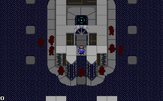
This sounds pretty cool and those graphics are quite nice, but it looks like the first hero in the party will be standing on the wall in that battle backdrop.
_________________
Locked
OHR Piano |
|
| Back to top |
|
|
Eggie
Joined: 12 May 2003
Posts: 904
|
| Posted: Wed Sep 06, 2006 7:35 pm Post subject: |
|
|
| 'Sounds groovy and looks groovy. I have a strong feeling that this game will be an exotic cup of OHR coffee, and I am looking forward to drinking it. |
|
| Back to top |
|
|
Pseudodragon
Musical Familiar

Joined: 01 Sep 2006
Posts: 12
Location: St. Petersburg, Florida
|
| Posted: Thu Sep 07, 2006 9:04 am Post subject: |
|
|
The graphics are really something!
_________________
"Don't give me what is good; give me what is true." |
|
| Back to top |
|
|
Shadowiii
It's been real.

Joined: 14 Feb 2003
Posts: 2460
|
| Posted: Fri Sep 08, 2006 9:33 am Post subject: |
|
|
Rock it, B. That looks neato. An OHR-Rogue would be interesting, but this looks like a cool start. I'll have to play it in...oh...nine months.
_________________
But enough talk, have at you! |
|
| Back to top |
|
|
Mr B
Joined: 20 Mar 2003
Posts: 382
|
| Posted: Fri Sep 08, 2006 2:04 pm Post subject: |
|
|
Wow...I wasn't expecting such unadulterated approval of my graphics!
I hate to disappoint everyone, but PPl won't be very rogue-ish. It's not even turn-based. The maps are premade. The most rogue-like aspect would be the permadeath, which I expect will turn out to be the main gripe.
Hmm...turn-based...nah; Hakkun would kill me. That'll have to wait for PP.
One a whim I decided to redo most of the maptiles -- I drew one new type of pillar, liked the style, and brought everything else over. Does the new look come across as too visually busy?

The first hero does indeed get too close to the wall, but he still stands on the floor. It's very close, and probably won't look correct for escaping. I'll be redoing the background due to the new tileset, so I mine as well start from scratch with this realization. |
|
| Back to top |
|
|
Calehay
...yeah.
Class B Minstrel

Joined: 07 Jul 2004
Posts: 549
|
| Posted: Fri Sep 08, 2006 4:47 pm Post subject: |
|
|
That one actually fixes some of the problems in the first one.
This looks interesting.
_________________
Calehay |
|
| Back to top |
|
|
Mr B
Joined: 20 Mar 2003
Posts: 382
|
| Posted: Wed Sep 13, 2006 1:03 pm Post subject: |
|
|
One concern I have with the new tileset is that the sidewalk tiles possess the same base color as the ceiling tiles. Since I've been working with them for so long I don't get particularly confused, but I am uncertain as to their effect on a first-time viewer.
I am writing documentation now (parallel to everything else), and am unsure how people would prefer things to be presented. The RPG elements are different enough that a player couldn't jump straight into the game without extreme frustration, so the text files will need to be read.
However, I know that a lot of documentation files frustrate readers by assuming the player knows either very little or very much. I am thinking of using colored text to distinguish between information that newbies need to read and the stuff that veterans should look at. Has anyone had experience with this kind of differentiation before? Did it work? Are there better ways? |
|
| Back to top |
|
|
Iblis
Ghost Cat
Joined: 26 May 2003
Posts: 1233
Location: Your brain
|
| Posted: Wed Sep 13, 2006 3:07 pm Post subject: |
|
|
The new tiles are great and as a first time viewer I have no problem telling them apart.
A simple way to separate the newb stuff from the non-newb stuff is just separate them into different sections. Have a "basic controls" section to explain things like "push up to go up" and another section for the rest.
_________________
Locked
OHR Piano |
|
| Back to top |
|
|
Mr B
Joined: 20 Mar 2003
Posts: 382
|
| Posted: Thu Sep 14, 2006 11:12 am Post subject: |
|
|
Okay. Most of the struggle has been between general RPG concepts (HP, damage, etc.) and the game-specific quirky and non-standard implementation. The two parts belong together logically, but not too together.
Thanks -- I'll get this thing worked out one way or another! |
|
| Back to top |
|
|
Mr B
Joined: 20 Mar 2003
Posts: 382
|
| Posted: Wed Sep 20, 2006 8:45 am Post subject: |
|
|
Due to suffering two occular migraines in a week's time, I need to severly scale back my computer use. This fact, in conjunction with the beginning of school next week, means that I won't get PPl released as quickly as I had hoped.
This project is not going on the back-burner; I simply cannot dedicate as much time to it as I would like for the foreseeable future. I do intend to release PPl as quickly as reasonably possible. Hold me to that!
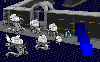
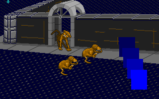
Here are two more pictures:

Is this picture bright enough? It is intended to be a night scene, so I didn't make it as bright as I could have.
This exemplifies the new-and-improved (yes, simultaneously!) battle backdrop. It isn't perfect, but it looks a lot better and provides enough room for the first hero.
Well, I'll update when I can -- I'm getting to the end of the "new screenshots" stage, so be prepared for boring text! |
|
| Back to top |
|
|
msw188
Joined: 02 Jul 2003
Posts: 1041
|
| Posted: Wed Sep 20, 2006 10:47 am Post subject: |
|
|
| The first picture is too dark for me. I can't even tell what it is. Is that a person in the foreground? Or a strange bird of some sort? The background looks pretty nice though. |
|
| Back to top |
|
|
TwinHamster
♫ Furious souls, burn eternally! ♫

Joined: 07 Mar 2004
Posts: 1352
|
| Posted: Wed Sep 20, 2006 10:51 am Post subject: |
|
|
There's obviously a five-tentacled-squid with a blue eye in the first screen.
And the second one has most definitely improved. However, the monkey behind the other monkeys looks a little odd. His back is completely unshaded and he's staring at me.
Bring on the txt! |
|
| Back to top |
|
|
Valigarmander
Bye-Bye

Joined: 04 Mar 2006
Posts: 750
Location: Nowhere
|
| Posted: Wed Sep 20, 2006 12:11 pm Post subject: |
|
|
| Ditto what everyone else said. I can't tell what the first one is supposed to be, but the background looks real nice. |
|
| Back to top |
|
|
|

