| View previous topic :: View next topic |
| Author |
Message |
Shadowiii
It's been real.

Joined: 14 Feb 2003
Posts: 2460
|
 Posted: Tue Aug 10, 2004 11:21 pm Post subject: Lain Posted: Tue Aug 10, 2004 11:21 pm Post subject: Lain |
 |
|
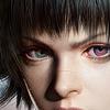
I was bored and grouchy last night, so I decided to pixelate this. For those who have seen "Serial Experiments Lain" and read my LJ know it is one of my most favorite anime ever. Lain (the girl star, duh) is about 14. I wondered what she'd look like older (I dunno, late teens, early 20s?)
So, here it is. Approx 1.5 hours, 12 colors, in paint.

I'm rather proud of it (I'm not very good at drawing...) so say something nice before bashing it. 
_________________
But enough talk, have at you! |
|
| Back to top |
|
 |
Iblis
Ghost Cat

Joined: 26 May 2003
Posts: 1233
Location: Your brain
|
| Posted: Tue Aug 10, 2004 11:51 pm Post subject: |
|
|
The eyes look good. This style of eyes isn't easy (at least not for me) so that's pretty cool. I like all the linework on the face. The wind effect is good too.
However, it looks really REALLY weird to have a black outline around the face stuff but then have colored outlines around the hair. Either use black for all the lines or color for all the lines, using both looks weird.
Her nose ends too far down on her face, I think. I'd move that up a bit, and then move her mouth up some too. Usually the bottom of the nose is the halfway mark between the eyes and the chin.
Her hair is too light, unless she's dyed in in these past years. In the series it was dark brown.
_________________
Locked
OHR Piano |
|
| Back to top |
|
|
rpgspotkale
ME Akume
Joined: 18 May 2004
Posts: 80
Location: South Africa
|
| Posted: Wed Aug 11, 2004 6:49 am Post subject: |
|
|
I like the eyes. But, those singled out hair strands over the face kindof ruin it.
A good aproach to the wind element though...
_________________
[IMG]http://img.photobucket.com/albums/v475/daviward/sovereignlegionbanner1-2fire.bmp[/IMG] |
|
| Back to top |
|
|
rpgspotKahn
Lets see...
Joined: 16 May 2004
Posts: 720
Location: South Africa
|
| Posted: Wed Aug 11, 2004 7:03 am Post subject: |
|
|
It looks pretty cool... I have to agree with Kale though, the hair strands look abit weird.
The eyes, for some reason that I cannot decifer, make the artwork seem a little too masculine. It is a girl right..??
Otherwise. Nice job.
_________________

2nd Edition out now! |
|
| Back to top |
|
|
Shadowiii
It's been real.
Joined: 14 Feb 2003
Posts: 2460
|
| Posted: Wed Aug 11, 2004 8:38 am Post subject: |
|
|
It would be more older woman (as I said, late teens, early twenties).
The hair color is because I'm using the OHR-Palette, and I didn't like the darker looking brown.
And just to prove I do listen to your comments...

And yes, the eyes are my favorite part. I actually drew them first and didn't want to draw the rest (was afraid I'd screw up my picture  ) )
_________________
But enough talk, have at you! |
|
| Back to top |
|
|
rpgspotKahn
Lets see...
Joined: 16 May 2004
Posts: 720
Location: South Africa
|
| Posted: Wed Aug 11, 2004 11:14 am Post subject: |
|
|
Its amazing how different it looks. It looks much better. Great work. 
_________________
2nd Edition out now! |
|
| Back to top |
|
|
Iblis
Ghost Cat
Joined: 26 May 2003
Posts: 1233
Location: Your brain
|
| Posted: Wed Aug 11, 2004 1:30 pm Post subject: |
|
|
Yeah, this looks way better. Good job.
_________________
Locked
OHR Piano |
|
| Back to top |
|
|
Setu_Firestorm
Music Composer

Joined: 26 Mar 2003
Posts: 2566
Location: Holiday. FL
|
|
| Back to top |
|
|
|


