 |
Castle Paradox
|
| View previous topic :: View next topic |
| Author |
Message |
Eggie
Joined: 12 May 2003
Posts: 904
|
 Posted: Fri Aug 20, 2004 7:07 pm Post subject: Deep Southern's Northern Roasted Art Posted: Fri Aug 20, 2004 7:07 pm Post subject: Deep Southern's Northern Roasted Art |
 |
|
This is Princess Tiadga.
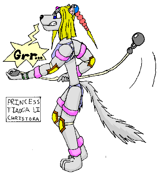
I think that the body is too tall, but I never was could with proportion. Let me note that I had drawn this in the hospital, and, well, I didn't get all the notes that I was sent on my previous art board, so please forgive me if you have to mention something again. More updates soon. I got a couple more drawings to colour. |
|
| Back to top |
|
 |
Uncommon
His legend will never die

Joined: 10 Mar 2003
Posts: 2503
|
| Posted: Fri Aug 20, 2004 8:04 pm Post subject: |
|
|
| She is way too skinny, etc, etc, you suck at proportion, etc, etc, why not try learning, etc, etc. |
|
| Back to top |
|
|
Rpeanut
Chop Chop

Joined: 16 Mar 2003
Posts: 160
Location: dunno
|
| Posted: Fri Aug 20, 2004 8:13 pm Post subject: |
|
|
It is an improvement,{from what i last saw} but i do agree with uncommon, she looks like a stick. the arms seem right but the waist is like something out of Genuise Book of World Records. 
_________________
...eh? |
|
| Back to top |
|
|
Moogle1
Scourge of the Seas
Halloween 2006 Creativity Winner


Joined: 15 Jul 2004
Posts: 3377
Location: Seattle, WA
|
| Posted: Fri Aug 20, 2004 8:17 pm Post subject: |
|
|
Yeah, something's wrong with a girl who has thicker legs than waist. Also, she seems to be squishing the steel ball she's holding.
_________________
|
|
| Back to top |
|
|
LeRoy_Leo
Project manager
Class S Minstrel
Joined: 24 Sep 2003
Posts: 2683
Location: The dead-center of your brain!
|
| Posted: Fri Aug 20, 2004 8:59 pm Post subject: |
|
|
Everything has been pointed out except the problem with the right arm. It is further from my point of veiw, yet it is bigger than the left. That may be the proportion thing that everyone sees. See? It's bigger than the Left arm, but the left arm should be bigger. Other than that, the proportions are pretty good. I DO like the feet stance.
Sorry...
_________________
Planning Project Blood Summons, an MMORPG which will incinerate all of the others with it's sheer brilliance...
---msw188 ---
"Seriously James, you keep rolling out the awesome like gingerbread men on a horror-movie assembly line. " |
|
| Back to top |
|
|
Squall
is fantastic

Joined: 02 Feb 2003
Posts: 758
Location: Nampa, Idaho
|
| Posted: Fri Aug 20, 2004 11:33 pm Post subject: |
|
|
It looks 2 dimensional. I know there's shading on it, but it looks like a cardboard cut out. And I agree, that torso simply cannot support...any amount of weight. She's what? 36x12x13?
And this could just be part of an irritation with the way female characters are portrayed in recent videogames, but WHAT IS THE POINT OF HAVING ARMOR IF IT'S JUST ENOUGH TO COVER YOUR PRIVATES? ...and knees and elbows. Also, keep in mind that tails are simply extensions of the backbone. it shouldn't branch out at a 100 degree angle. And that weapon thing she's swinging is just about to hit her in the back of the head.And I'm kind of confused with what the hair is doing. It looks like there's one pony tail thing, and then one on the side? A perfect spike, I don't want to think about how much gel that took. Other than those things, and the fact that I generally dispise furry art, good job!
_________________
You got film in my video game!
You got video game in my film! |
|
| Back to top |
|
|
Fenrir-Lunaris
WUT

Joined: 03 Feb 2003
Posts: 1747
|
| Posted: Sat Aug 21, 2004 10:16 am Post subject: |
|
|
Considering it's probably done in MSpaint it's not overwhelmingly bad. At least we know what it is
With women's bodies, a good rule of thumb to keep them from appearing too skinny is to try to make the hips at least as wide as their shoulders. The torso from the shoulders to the buttocks when viewed in profile (as you've drawn it) or face on, should be somewhat hourglass shaped. The hips are also the center of a person's weight, so every thing above and below that point *should* appear to weigh about the same amount, and they *should* be roughly the same length. If a character's legs are 3 feet long, then to look proportionate, the torso and head should be roughly 3 feet long. With Furry characters, if the top seems larger than the legs, just increace the size of the tail. A 2:3 ratio in body mass is generally acceptable.
More on height, in most proportional drawings, an adult person's body should be roughly equal to 6.5 to 7 heights of their head. With anthropomorphic characters, this proportion changes to 7-8 heights, simply because an animal's head is somewhat flatter than a human being's. (Of course this brings up the question of whether they still have the same proportionally sized brain!) If this seems unusual, consider that comic book superheros such as Superman are traditionally drawn 9-10 head heights, to make them look more imposing!
The last part I'll mention has to do with the feet, and this more or less only applies to anthropomorphics. If the feet are plantigrade (like human feet), then the legs can be straight, more or less. Use your own body as a reference. A character with digitgrade feet such as a wolf or most animals in general will have a different leg structure. Firstly, the heel will actually be above the ground some distance, and add to the height of the legs somewhat. Try walking just on the balls of your feet and you'll get the general idea of what it's like to walk Digitgrade. An example here: http://www.castleparadox.com/fenart/Horrible/hatisketch.jpg
Secondly, and you've already gotten this down, but with digitgrade feet, they have to be appropriately large enough to support the weight of the character. One of the reasons a domestic dog is not suited to walking upright has to do with the size of its feet: the larger the size of your feet in contact with the ground, the more weight can be supported.
And she looks like a cross between Christina Aguillera and Krystal from Starfox Adventures.
Here's to hoping she's a natural blonde |
|
| Back to top |
|
|
Eggie
Joined: 12 May 2003
Posts: 904
|
| Posted: Sun Aug 22, 2004 4:04 pm Post subject: |
|
|
I said: "Let me note that I had drawn this in the hospital, and, well, I didn't get all the notes that I was sent on my previous art board, so please forgive me if you have to mention something again."
Uncommon said: "She is way too skinny, etc, etc, you suck at proportion, etc, etc, why not try learning, etc, etc."
Stop bashing me. I didn't get your previous memo when you posted it on my other board.
Moogle1 said: "Also, she seems to be squishing the steel ball she's holding."
It isn't steel. It's a hard pulsing gray material.
Fen said: "And she looks like a cross between Christina Aguillera and Krystal from Starfox Adventures."
She was actually based on Britney Spears, and Xena. I took it down a odd path.
Squall squalled: "And this could just be part of an irritation with the way female characters are portrayed in recent videogames, but WHAT IS THE POINT OF HAVING ARMOR IF IT'S JUST ENOUGH TO COVER YOUR PRIVATES?"
I dunno. I just kinda made it that way. She's not really the fighting type (being a princess.) I actually tried to create it in a way that her arm and knee pads were jewelry. I was still at the time, messing around with her character, and I still am.
Fen said: "Secondly, and you've already gotten this down, but with digitgrade feet, they have to be appropriately large enough to support the weight of the character."
Are you thinking like Wile E. Coyote?
I actually am going to show you guys a couple more of these pictures that haven't really done any improvement, but some look okay in some ways. |
|
| Back to top |
|
|
rpgspotKahn
Lets see...

Joined: 16 May 2004
Posts: 720
Location: South Africa
|
| Posted: Mon Aug 23, 2004 5:03 am Post subject: |
|
|
I think there is alot of improvement to be done... I agree with the points of the others.
Whats the point of showing art and wanting critisism if you are just going to show the same art with the same mistakes, even after we have said where you can improve... Id rather see some improved art. Some art where we can all see the effort that we put in with writing these posts come to life...
And
Its what critisism is for...  Its only there to help you... Its only there to help you...
_________________

2nd Edition out now! |
|
| Back to top |
|
|
MultiColoredWizard
Come back, baby!
The Breastmaster

Joined: 01 Feb 2003
Posts: 1232
|
| Posted: Mon Aug 23, 2004 12:46 pm Post subject: |
|
|
rpgspotkahn you goddamn douchebag. eggie's improved by a lot, but you're just being a bitch and making him angry about it. he's already heard the 'criticism is to help you talk'. eggie's only problem was the way he talked to uncommon(but he's a jerk with honesty... which is a great combo).
ps criticism isn't bashing, it's helping.
fag.
XD |
|
| Back to top |
|
|
Shadowiii
It's been real.

Joined: 14 Feb 2003
Posts: 2460
|
| Posted: Mon Aug 23, 2004 2:07 pm Post subject: |
|
|
Way too skinny, and the hair could use some highlights.
You are improving, though.
_________________
But enough talk, have at you! |
|
| Back to top |
|
|
Eggie
Joined: 12 May 2003
Posts: 904
|
| Posted: Wed Aug 25, 2004 8:49 am Post subject: |
|
|

Okay, I can already see that I made her legs too big, and I guess too long, but it seems better.
And Ryan over there needs teeth. I screwed up on the mouth, and Uncommon, I didn't put lips 'cause I never got the memo to start on lips by you on the other forum at the time. |
|
| Back to top |
|
|
LeRoy_Leo
Project manager
Class S Minstrel
Joined: 24 Sep 2003
Posts: 2683
Location: The dead-center of your brain!
|
| Posted: Wed Aug 25, 2004 10:10 am Post subject: |
|
|
No, I think the legs are perfect. Ryan doesn't really need teeth, unless he has some kind of overbite problem, because they are inside his mouth. The mouth is covering them up. It's very well done!
First, the legs. The legs are as fat as they should be. Looks like you took Fen's advice. Excellent. They are called thys (god I hope I spelled that right). In Females they tend to be wider.
The position of the arms and legs in the way that she is sitting is done just right. Nothing wrong as far as I can tell.
I can still kind of see how she is extremely skinny, but it's less noticeable because of her posture. So People should be able to tollerate it this time. 0.o
Her eyes look scarey. Did you mean them that way? The pupil could hang just below the top lid to make her look more... Calm. Unless she actually is wanting to eat our friend Ryan here. 
You improve every time you do a pic, Eggy. Keep it up.
_________________
Planning Project Blood Summons, an MMORPG which will incinerate all of the others with it's sheer brilliance...
---msw188 ---
"Seriously James, you keep rolling out the awesome like gingerbread men on a horror-movie assembly line. " |
|
| Back to top |
|
|
Shadowiii
It's been real.
Joined: 14 Feb 2003
Posts: 2460
|
| Posted: Wed Aug 25, 2004 10:15 am Post subject: |
|
|
The guy's clothes look drawn on, not an actual piece of clothing.
_________________
But enough talk, have at you! |
|
| Back to top |
|
|
Moogle1
Scourge of the Seas
Halloween 2006 Creativity Winner
Joined: 15 Jul 2004
Posts: 3377
Location: Seattle, WA
|
| Posted: Wed Aug 25, 2004 11:42 am Post subject: |
|
|
It looks like a talk show.
Yes, her leg is too wide. It shouldn't be anorexically thin like many people mistakenly draw it, but it's huge as-is.
Guy there is very stiff. No one has posture like that. Also, his shirt extends too far down. Look at where your shirt falls when you sit. Unless your shirt is huge, it goes a little below your belt line.
And he doesn't need teeth -- in a mouth position like that, anyway. It looks like you're trying for a slightly anime style. If that's the case, his open mouth actually goes inside his face.
Also, this is minor, but he's got a weird head bulge on the back (just under the first rise in his hair). He should probably have hair there anyway.
Animal girl is pretty decently drawn, except for the leg. Props.
_________________
|
|
| Back to top |
|
|
|
|
You cannot post new topics in this forum
You cannot reply to topics in this forum
You cannot edit your posts in this forum
You cannot delete your posts in this forum
You cannot vote in polls in this forum
|
Powered by phpBB © 2001, 2005 phpBB Group
|

