| View previous topic :: View next topic |
| Author |
Message |
LeRoy_Leo
Project manager
Class S Minstrel
Joined: 24 Sep 2003
Posts: 2683
Location: The dead-center of your brain!
|
 Posted: Sat Sep 10, 2005 3:19 pm Post subject: Keegan day Posted: Sat Sep 10, 2005 3:19 pm Post subject: Keegan day |
 |
|
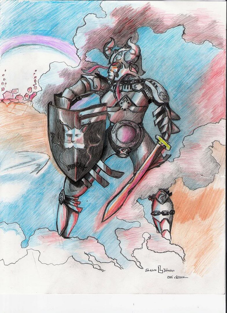
Keegan day is the second Saturday in September, named for the suffering of my late friend Keegan Penney. It takes place shortly after school (and the ensueing flood of responsibility) begins for most youth and shortly before Patriot day. It is a day in which adolecents may stop blubbering about how difficult life is, fight back the "slings and arrows", and be strong. It is a day in which no sucides can take place, lest you look like a total fuck wit.
This picture is a rare treat for me. It isn't often that I get the inspiration to do colored illustrations.
May Keegan's spirit never be forgotten...
_________________
Planning Project Blood Summons, an MMORPG which will incinerate all of the others with it's sheer brilliance...
---msw188 ---
"Seriously James, you keep rolling out the awesome like gingerbread men on a horror-movie assembly line. " |
|
| Back to top |
|
 |
SilentAngel
The Angel of Silence

Joined: 16 Dec 2003
Posts: 122
Location: The comfiest chair in #CastleParadox
|
| Posted: Sat Sep 10, 2005 4:24 pm Post subject: |
|
|
Nice, Leroy!
I particularly like the two-hued shading you've done in this picture, it looks kinda like there's two different light sources. The only suggestion I have for this picture is to further build up the sky colour in the top left - you can see that it's a coloured pencil picture. If you add other colours to the mix it might make it look more like a pseudo-crosshatch rather than just lines. Other than that, good job! 
_________________
Current Projects:
Hikari no Senshi - Inperiaru Taisen: ~10% Complete
http://www.castleparadox.com/forum/download.php?game=392
Stepmania Online Stats:

Next song to pass on Stepmania: Paranoia Survivor Max (Heavy)
Next song to pass on DDR: MaxX Unlimited(Standard)
|
|
| Back to top |
|
|
Moogle1
Scourge of the Seas
Halloween 2006 Creativity Winner


Joined: 15 Jul 2004
Posts: 3377
Location: Seattle, WA
|
| Posted: Sat Sep 10, 2005 8:47 pm Post subject: |
|
|
The shading/coloring is pretty good overall. The design is awkward, though. Consider the following:
* It becomes very obvious that you do not want to draw his feet when both legs are covered up just above the ankles. If you suck at drawing feet, cover his legs a little higher than that. His left foot looks like it should only be partially obscured by the cloud and the rest should be sticking out.
* How is he holding that sword? For that matter, does he even have a sword hand?
* How in the world is he holding that shield?
* Speaking of the shield, is the word "PENIS" written on it? Or what?
_________________
|
|
| Back to top |
|
|
SilentAngel
The Angel of Silence
Joined: 16 Dec 2003
Posts: 122
Location: The comfiest chair in #CastleParadox
|
| Posted: Sun Sep 11, 2005 3:07 am Post subject: |
|
|
I just noticed that, Moogle (The word which might or might not be "Penis"). And that's kinda scary, Leroy.
_________________
Current Projects:
Hikari no Senshi - Inperiaru Taisen: ~10% Complete
http://www.castleparadox.com/forum/download.php?game=392
Stepmania Online Stats:
Next song to pass on Stepmania: Paranoia Survivor Max (Heavy)
Next song to pass on DDR: MaxX Unlimited(Standard)
|
|
| Back to top |
|
|
hireintelligence
Joined: 15 Jul 2005
Posts: 50
Location: NSW, Australia
|
| Posted: Sun Sep 11, 2005 3:39 am Post subject: |
|
|
There's really not much going on to the left of the shield except a sort of white smudge but other than that its great.
I think the shield looks more like it says Penne. |
|
| Back to top |
|
|
Mike Caron
Technomancer

Joined: 26 Jul 2003
Posts: 889
Location: Why do you keep asking?
|
| Posted: Sun Sep 11, 2005 8:05 pm Post subject: |
|
|
The shield says Penney, i.e. the friend he speaks of.
I like it, but how he holds the shield makes my wrist hurt just by looking at it...
_________________
I stand corrected. No rivers ran blood today. At least, none that were caused by us.
Final Fantasy Q
OHR Developer BLOG
Official OHRRPGCE Wiki and FAQ |
|
| Back to top |
|
|
LeRoy_Leo
Project manager
Class S Minstrel
Joined: 24 Sep 2003
Posts: 2683
Location: The dead-center of your brain!
|
| Posted: Sun Sep 11, 2005 9:54 pm Post subject: |
|
|
Thanks for the comments so far, all.
Let me explain.
There are, indeed, two light sources in this image. One from the sword and one from the blue energy in front of the character.
I like SA's suggestion for the cross hatch of color instead of scribbleness... Unfortunately, I scribbled the background color to save time. While your suggestion would definitely be best, I simply ran out of time.
I coverred his feet with smoke for a similar reason. I thought it was a creative and easy way to avoid doing his feet. 
Oh my God. He's supposed to have a hand... Looks like he replaced it with his sword. Bad-ass!
And he is holding his shield by the strap. I know it looks wierd. He is struggling to hold the sheild because he is being barraged with magic. That's what I was aiming at, but I ran out of time.
Hire and Pkmn are right. It says Penney; my friend's last name. It does look an aweful lot like the word "penis" though. Sorry. O.O
Hahahaha! Severe contrast issues, me thinks. Hard to read.
Thanks again. Is there anything else?
_________________
Planning Project Blood Summons, an MMORPG which will incinerate all of the others with it's sheer brilliance...
---msw188 ---
"Seriously James, you keep rolling out the awesome like gingerbread men on a horror-movie assembly line. "
Last edited by LeRoy_Leo on Mon Sep 12, 2005 10:08 am; edited 1 time in total |
|
| Back to top |
|
|
SilentAngel
The Angel of Silence
Joined: 16 Dec 2003
Posts: 122
Location: The comfiest chair in #CastleParadox
|
| Posted: Mon Sep 12, 2005 12:03 am Post subject: |
|
|
Another suggestion with two or more light sources - try and blend the hue shades from those light sources into the original material you're trying to colour. For example, if you have a grey metal, and the light sources are blue and red (say this picture), you would have a grey-red shading where it's at its most extreme....fading to a grey...and then going to the blue-grey. Depending on the light sources, you could even end up with a purple-grey in places if they're close together.
Another suggestion with this picture would be to blend the shading on the sword. At the moment it's distinct colours (red -> orange -> blue) which could look like a magical-type material if it gradually blended from one shade to the next.
Other than that, I can't see any big flaws. Overall you've got the shading in the correct places relative to the implied light sources, it's just a matter of blending them.
Just giving suggestions on the shading, mainly from stuff I've learnt whilst colouring. Hope it helps
_________________
Current Projects:
Hikari no Senshi - Inperiaru Taisen: ~10% Complete
http://www.castleparadox.com/forum/download.php?game=392
Stepmania Online Stats:
Next song to pass on Stepmania: Paranoia Survivor Max (Heavy)
Next song to pass on DDR: MaxX Unlimited(Standard)
|
|
| Back to top |
|
|
rpgspotkale
ME Akume
Joined: 18 May 2004
Posts: 80
Location: South Africa
|
| Posted: Mon Sep 12, 2005 12:44 am Post subject: |
|
|
The lighting is good, the overall character interesting, and the meaning for it, deep. 
Overall a good piece.
Congrats Leroy. 
[/quote]
_________________
[IMG]http://img.photobucket.com/albums/v475/daviward/sovereignlegionbanner1-2fire.bmp[/IMG] |
|
| Back to top |
|
|
Setu_Firestorm
Music Composer

Joined: 26 Mar 2003
Posts: 2566
Location: Holiday. FL
|
|
| Back to top |
|
|
Joe Man

Joined: 21 Jan 2004
Posts: 742
Location: S. Latitude 47°9', W. Longitude 123°43'
|
| Posted: Mon Sep 12, 2005 6:55 pm Post subject: |
|
|
| LeRoy_Leo wrote: | Hire and Pkmn are right. It says Penney; my friend's last name. It does look an aweful lot like the word "penis" though. Sorry. O.O
Hahahaha! Severe contrast issues, me thinks. Hard to read. |
When I die, I wish that would be the word people use to remember me.
_________________
"Everyone has 200,000 bad drawings in them, the sooner you get them out the better."
~Charles Martin Jones
Last edited by Joe Man on Fri Dec 13, 1957 1:21 am; edited 2,892 time in total |
|
| Back to top |
|
|
|


