| View previous topic :: View next topic |
| Author |
Message |
djfenix

Joined: 12 Mar 2003
Posts: 359
|
 Posted: Sat Jan 24, 2009 6:32 pm Post subject: Portraits! Posted: Sat Jan 24, 2009 6:32 pm Post subject: Portraits! |
 |
|
Not many people reply on SS, so i post here as well 
    |
|
| Back to top |
|
 |
Joe Man

Joined: 21 Jan 2004
Posts: 742
Location: S. Latitude 47°9', W. Longitude 123°43'
|
| Posted: Sun Jan 25, 2009 10:05 am Post subject: |
|
|
You might want to tone down the white you use in the teeth, especially in the second pose for the last character, although it does work as is.. Also, the last pose for the woman looke a little. . . chipmunky. Otherwise, great job.
_________________
"Everyone has 200,000 bad drawings in them, the sooner you get them out the better."
~Charles Martin Jones
Last edited by Joe Man on Fri Dec 13, 1957 1:21 am; edited 2,892 time in total |
|
| Back to top |
|
|
djfenix
Joined: 12 Mar 2003
Posts: 359
|
| Posted: Mon Jan 26, 2009 5:22 am Post subject: |
|
|
Kinda hard to tone down the teeth and still make it look like teeth. I'll see what else i can do.

Removed the teeth from Lynn on the last portrait, and added some anti-aliasing tones and some extra highlights |
|
| Back to top |
|
|
Mariel

Joined: 15 Oct 2008
Posts: 78
Location: In your dreams
|
| Posted: Tue Jan 27, 2009 7:03 am Post subject: |
|
|
I don't think the highlights are doing you any favors. The light colored ones look good, but the white is too much, especially on the last guy. Those are pretty cool portraits though.
_________________
"I think civility flew out the window the second I found the lawnmower. With dignity and humanity splattered on the walls." |
|
| Back to top |
|
|
Bob the Hamster
OHRRPGCE Developer

Joined: 22 Feb 2003
Posts: 2526
Location: Hamster Republic (Southern California Enclave)
|
| Posted: Tue Jan 27, 2009 9:32 am Post subject: |
|
|
| I have mixed feelings about the highlights. I think that the brightness of them is okay (even on Diagr) but the high contrast makes the pixels stand out and appear more boxy. If you have a palette color to spare, then a mid-tone to soften the edges of the highlights would probably help a lot. |
|
| Back to top |
|
|
The Drizzle
Who is the Drizzle?

Joined: 12 Nov 2003
Posts: 432
|
| Posted: Tue Jan 27, 2009 10:27 am Post subject: |
|
|
| Quote: | | If you have a palette color to spare, then a mid-tone to soften the edges of the highlights would probably help a lot. |
That's actually a great idea. Give it a shot, see how it turns out. One thing I feel I should mention though. Bright highlights such as you've been using only really occur when something is backlit and therefor should only appear around the edges of the person. Visual example:
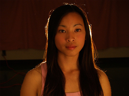
So really the only one whose highlights are working naturally is the blonde guy.
_________________
My name is...
The shake-zula, the mic rulah, the old schoola, you wanna trip? I'll bring it to yah... |
|
| Back to top |
|
|
djfenix
Joined: 12 Mar 2003
Posts: 359
|
| Posted: Thu Jan 29, 2009 9:44 am Post subject: |
|
|

Toned down the highlights, but kept some of that extra depth i was trying to achieve. |
|
| Back to top |
|
|
|

