| View previous topic :: View next topic |
| Author |
Message |
Rpeanut
Chop Chop

Joined: 16 Mar 2003
Posts: 160
Location: dunno
|
 Posted: Sat Mar 13, 2004 11:49 am Post subject: My Art, look at it then i get to burn it Posted: Sat Mar 13, 2004 11:49 am Post subject: My Art, look at it then i get to burn it |
 |
|

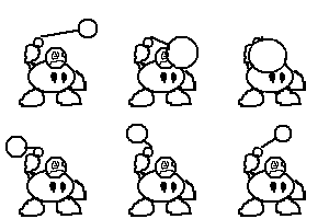
It is in your hands to judge the fate of these hero sprites, and o god i know the last two are horrible. Once your all done, if these were on paper i get to burn them. I gotta live up to my reputation of a freakingpyro technic
eheheh sorry there two small,... if i resized them they would look awful.
So Criticse Away.
_________________
...eh? |
|
| Back to top |
|
 |
xaero
me

Joined: 30 Dec 2003
Posts: 101
Location: somewheres
|
 Posted: Sat Mar 13, 2004 12:23 pm Post subject: Posted: Sat Mar 13, 2004 12:23 pm Post subject: |
 |
|
pretty good, i havent seen a sprite sitting down before so it gets points for orinality, only mistakes i can pick up is the 4th from left because it doesn't have a black outline like the others, the 1st ones shoulder is too close to his neck, and the last ones knee and calf dont join very well, and he looks like he is standing too forward on his tip-toes, but with a bit of work i think they would be awesome
________
iolite review
Last edited by xaero on Thu Feb 03, 2011 7:59 am; edited 1 time in total |
|
| Back to top |
|
 |
The Drizzle
Who is the Drizzle?

Joined: 12 Nov 2003
Posts: 432
|
 Posted: Sat Mar 13, 2004 3:55 pm Post subject: Posted: Sat Mar 13, 2004 3:55 pm Post subject: |
 |
|
You should make the size of these guys bigger so that people can see the details better. That being said, your attack poses are awesome, which has been said, but they're all somewhat original. But...
The second one looks like she's getting hurt (at least to me). She's completely off balance and looks like she's falling back. That's not exactly intimidating.
The hair on the fourth one look pretty flat too. And he looks too much like Sephiroth.
You might want to make the shorts of the last guy a little longer. He looks like a sissy with those shorts.
The sword of the first guy (that is a sword right) needs to be given a different shape because it looks a bit odd to me. Maybe turn the sword across his body so that you can draw it longer
Good stuff. Keep up the good work.
_________________
My name is...
The shake-zula, the mic rulah, the old schoola, you wanna trip? I'll bring it to yah... |
|
| Back to top |
|
 |
LeRoy_Leo
Project manager
Class S Minstrel

Joined: 24 Sep 2003
Posts: 2683
Location: The dead-center of your brain!
|
 Posted: Sat Mar 13, 2004 9:56 pm Post subject: Posted: Sat Mar 13, 2004 9:56 pm Post subject: |
 |
|
| The Drizzle wrote: | | You should make the size of these guys bigger so that people can see the details better. |
Hello Driz... Just wanted to let you know of der makeshift solution to this. Copy thy pictures above, then venture into ye olde MS paint. Paste yon pictures into yon document thusly, and BOM! You get to use the magnifying glass to enhance them there. (I hope you know old English enough to understand that dribble. Or enough to point out my obvious flaws)
Although I will say this. Those pictures all have fine outlines of black. Except for the fourth, which REALLY needs it because it has white hair and all. (Tip: Don't use the black or dark outline around a dark area, like a black coat, or dark robe. Makes the pic more bulky)
The pose of the first one is that of a very uptight fellow (This from what I have examined UP CLOSE). It is a very awsome pose. The shoulder is right on the spot where it should be. He has a white/silver arm pad on the shoulder closest to us (his right I believe)
The second one needs more detail so that you can see where the lute begins and the person ends. 
in the third one I especially admire the way the cloth on the robe goes out like that. You have captured the movement of cloth very well in this one. I also like how his hair is on fire!
I already mentioned the fouth one in the start. ^
The last one looks like his legs are bending too much. He cannot stay squatting for ever, you know. He will fall, if you don't mae him just a little more balanced.
_________________
Planning Project Blood Summons, an MMORPG which will incinerate all of the others with it's sheer brilliance...
---msw188 ---
"Seriously James, you keep rolling out the awesome like gingerbread men on a horror-movie assembly line. "
Last edited by LeRoy_Leo on Sat Mar 13, 2004 10:00 pm; edited 1 time in total |
|
| Back to top |
|
 |
The Drizzle
Who is the Drizzle?

Joined: 12 Nov 2003
Posts: 432
|
 Posted: Sat Mar 13, 2004 9:59 pm Post subject: Posted: Sat Mar 13, 2004 9:59 pm Post subject: |
 |
|
Haha, yeah I know, you could do it yourself, but it would be easier for everyone if he did it.
_________________
My name is...
The shake-zula, the mic rulah, the old schoola, you wanna trip? I'll bring it to yah... |
|
| Back to top |
|
 |
LeRoy_Leo
Project manager
Class S Minstrel

Joined: 24 Sep 2003
Posts: 2683
Location: The dead-center of your brain!
|
 Posted: Sat Mar 13, 2004 10:01 pm Post subject: Posted: Sat Mar 13, 2004 10:01 pm Post subject: |
 |
|
Only takes ten seconds. *Leroy looks up at you encouragingly with the dumbest face that you have ever seen*
_________________
Planning Project Blood Summons, an MMORPG which will incinerate all of the others with it's sheer brilliance...
---msw188 ---
"Seriously James, you keep rolling out the awesome like gingerbread men on a horror-movie assembly line. " |
|
| Back to top |
|
 |
The Drizzle
Who is the Drizzle?

Joined: 12 Nov 2003
Posts: 432
|
 Posted: Sat Mar 13, 2004 10:03 pm Post subject: Posted: Sat Mar 13, 2004 10:03 pm Post subject: |
 |
|
That's a lot of people's 10 seconds. If he does it himself it wouldn't take as long, and it would encourage more people to observe the details of the sprites.
_________________
My name is...
The shake-zula, the mic rulah, the old schoola, you wanna trip? I'll bring it to yah... |
|
| Back to top |
|
 |
LeRoy_Leo
Project manager
Class S Minstrel

Joined: 24 Sep 2003
Posts: 2683
Location: The dead-center of your brain!
|
 Posted: Sat Mar 13, 2004 10:17 pm Post subject: Posted: Sat Mar 13, 2004 10:17 pm Post subject: |
 |
|
Yes. You are correct, sir. And I suppose if you add all of those 10 seconds together, you get a whole year of time wasted? 
Hopefully then only dedicated art critiquers will respond. If you can't take ten seconds, then do you care enough about art? (The poster's art that is)
Time IS of the essence though.
PS: Don't hate me. I said Critiquers. Not a Critiquer in general... So you all may very well be dedicated enough to allow one measly moment of time be spent to take a closer look... Prove it, Drizz.
But I digress. Continue this with a PMing. On with the thread we say!
_________________
Planning Project Blood Summons, an MMORPG which will incinerate all of the others with it's sheer brilliance...
---msw188 ---
"Seriously James, you keep rolling out the awesome like gingerbread men on a horror-movie assembly line. " |
|
| Back to top |
|
 |
Pictoyaya
Joined: 17 Feb 2004
Posts: 21
|
 Posted: Sat Mar 13, 2004 10:50 pm Post subject: Posted: Sat Mar 13, 2004 10:50 pm Post subject: |
 |
|
Let's see... Okay, for anime characters, the proportions aren't wrong, since their legs are longer then their bodies. Though it lacks consistency with the last one, who is in right proportion.
The first one has bad shading on his cape. You can fix this by studying Alucard's cape for example:

Simply notice the darker shade is folded over the inside, where the lighter color depth is.
Also, the shoulder on his left (with the guard on it) is out of proportion with his neck. So allign it to the proportion of his other shoulder. His sword is... bent. Straighten the outline. And I suggest to make it shorter since we can't see the rest of it. =P
The second one... I don't understand why the bard is facing opposite to the enemies. Though the colors of his shirt and pants clash. You could at least replace them with a color that won't. I am not certain if you're out of colors, though shade his boots with another brown. Essentially the bottom on the one on his right.
The third one reminds me of the bard enemy from FFH-2. Though anyway... good shading, though the red clashes with the black outline, so make the outline black. And give his eyes pupils, ala the others.
Sephiroth? Okay... he wants at least a black outline too. His eyes are cross eyed. The last one is Okay, though it reminds me to talk about the stances of these... the stances are different to eachother, and they seem stiff as if they lack animation. The stances are really right for an art scene, compared to hero graphics, at least... |
|
| Back to top |
|
 |
MultiColoredWizard
Come back, baby!
The Breastmaster

Joined: 01 Feb 2003
Posts: 1232
|
 Posted: Sun Mar 14, 2004 8:33 am Post subject: Posted: Sun Mar 14, 2004 8:33 am Post subject: |
 |
|
Er, just so you know, don't use a lighter shade of what color the cape is for the inside(unless it's supposed to be lighter).
When I did that Alucard rip I had the equipment on that made it that color.
To see the full rip, go to: http://www.castleparadox.com/mcwart/work/Alucard-sotn.gif |
|
| Back to top |
|
 |
Rpeanut
Chop Chop

Joined: 16 Mar 2003
Posts: 160
Location: dunno
|
 Posted: Sun Mar 14, 2004 8:44 am Post subject: Posted: Sun Mar 14, 2004 8:44 am Post subject: |
 |
|
Thanks for the suggestions, and yes the 4th one is supposed to be sephiroth. The inside of the cape should be darker as the person is blocking out the light from it. The 1st one heheh i took some elements from the Kingdom Hearts Cloud. The 5th one i'm gonna redo totally all over, because he is actually supposed to be fatter. But then thats if i actually get around to doing that.
_________________
...eh? |
|
| Back to top |
|
 |
Rpeanut
Chop Chop

Joined: 16 Mar 2003
Posts: 160
Location: dunno
|
 Posted: Thu Apr 01, 2004 4:54 pm Post subject: BUMP MORE OF MY ART Posted: Thu Apr 01, 2004 4:54 pm Post subject: BUMP MORE OF MY ART |
 |
|
BUMP MORE OF MY ART, Im just to lazy to make a new topic so critise away... again

MUAHAHAHAH
...my new sprites suck more than my old ones do...
_________________
...eh? |
|
| Back to top |
|
 |
|


