 |
Castle Paradox
|
| View previous topic :: View next topic |
| Author |
Message |
Shadowiii
It's been real.

Joined: 14 Feb 2003
Posts: 2460
|
 Posted: Sun Mar 28, 2004 9:31 pm Post subject: Stop Graphical Preview/Critique [Image Heavy] Posted: Sun Mar 28, 2004 9:31 pm Post subject: Stop Graphical Preview/Critique [Image Heavy] |
 |
|
Stop Graphical Preview or How I Learned to Stop Worrying and Love Pixelation
Ok. I've been working on some graphics for Stop (and some old stuff I found that looked pretty cool), so I thought I'd post it up and see what you guys think. As I stated on my livejournal, all negative criticizm is accepted, though I do like positive re-enforcement as much as possible. 
Ok, first off, heroes. Note that sometimes it looks like attack animations won't be smooth (ie the weapon reaches right to the edge of the screen). If you've played Stop you'll note I fixed that by making the attack be a "slash" animation so it looks somewhat realistic. Just wanted to point that out. 

Here is Stop (at 2x). This hero is only used in two battles in Stop, though iti s the main hero pic in Stop^2. It is about a year and a half old, but I still think her kneeling death pic is cool.

And here she is as a child (April). This is the main heroine of Stop. I like her casting frame.

Null Set. Originally planned to be used in Lacrymosa, I decided to put it in Stop instead because I think he's cool. The death graphic is the worst, simply because the original (which was beautiful) was lost in a freak HD crash so I re-drew it fast and sloppily. Oh well.

Rosemary. Stop's best friend through most of her childhood. Thats basically all I can say about this one.

Elvina, the kick boxer. She has two attack abilities: kick or punch (hence the casting frame) in an attempt to make the battles funner. For teh record, that is a Kick-Boxing style fighting stance, with a Tae-Kwon-Do style front leg front kick, except she doesn't lean back.

This is...some guy. He never really got a name. He throws swords. I was going to use him in Secret Project but I never got around to it. Whether he'll be in Stop or not still isn't decided...
Ok, enough heroes. Now to some tilemaps. Sadly I don't have many yet, but more will come. Really.

Its a house. Wee slanty tiles. I like the little dirt rising...thing.

On a hot day, why not stand in the shade?
And now, what all my LJ readers have been waiting for, THE ITERATIONS! (bum bum bummmm!)
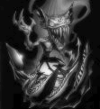
The story behind them: The shadow is a corrupting power. As one grabs a hold of it it grabs back. If you pull too much it it might be difficult to pull yourself out. The more you use it, the more corrupt you become. Shadow-born are each gifted with a Nightmare Weapon, a weapon used to directly channel power through the Shadow. When one equips it, it becomes a genuine effort to remain themselves. This is shown through the iterations. By the time one reaches the Infinite iteration (also known as the Deus iteration), they are basically saturated in their own power. It takes quite a lot to pull someone out of an Infinite iteration.

Joseph, normal fighting graphic. I'm proud of this one, though his left leg still needs some work.

The first iteration. The wielder still retains quite a bit of self, but the corrupting power is begining to show itself.

Ugh,l I dont' have a good picture of thise one. Sorry its so...small and cropped, but it was too big to fit lengthwise. There will be a shadow under him, as he is floating. The corruption is spreading in this, the second iteration. Soon all sanity will be lost as one gives themselves up to the Shadow's power.
Infinite 1x Size (actual pixel size):

Infinite 2x Size (for better viewing):

Brings new meaning to the words "Mad with Power." Joseph is lost to his own corruption. The wings, which first were a symbol of power, now appear almost parasitic they are so large and forboding.
This one was too big to import as an enemy. It was around 10 80x80 enemies, and hence my only choice was to import it with a backdrop. Here is what I got:

I like that backdrop ( ) )
Ok, that's it for now. I might just add on to this thread when I draw something worth posting. I would have posted some Indoor tilemaps or NPCs, but they aren't polished enough for viewing yet.
Again, comments are always appreciated. Thanks in advance for all the feedback you give.
Oh yeah, with any luck this game will be done by the second or third week in April (I plan on devoting all of spring break to it), pushing it back from its April 1st original deadline. Sorry, I got sick and am overwhelmed with school.
_________________
But enough talk, have at you! |
|
| Back to top |
|
 |
Catfish
That P*ssed Off N00b
Joined: 05 Jan 2004
Posts: 53
Location: Small Island Off The Coast Of Another Small Island Which Is Off The Coast Of Another Small Island...
|
| Posted: Sun Mar 28, 2004 11:41 pm Post subject: AHHHHHHHHHHHHHHHH |
|
|
-Screams Like Little Girl-
AMAZING
Clap Clap Clap!
_________________
"Look at the young men fighting, Look at the women crying. Look at the young men dying, the way they've always done before.

BSOHR Told me to put this on! |
|
| Back to top |
|
|
Flamer
The last guy on earth...
Joined: 04 Feb 2003
Posts: 725
Location: New Zealand (newly discovered)
|
| Posted: Sun Mar 28, 2004 11:45 pm Post subject: |
|
|
i see some copy+paste action going on in the hero battle graphics
they're not bad, but only marginally good. (i love the Elvina's style  ) )
the maptiles took me by surprise, the colour contrast is amazing and the detail is great (except the shadow, where there's nothing but that shadow)
the second maptile needs work on the shadow though, it doesn't look plausible, i mean... could a house's shadow possibly do such a feat
the first enemy is good, much detail in the clothing and body structure.
infinity is a whole different story, impossibly menancing and incredible 
i mean, in combination with that background, you get the sense that you're fighting the battle of the end of the world (which is great, coz i've never actually seen any final bosses that give me that feeling before)
all in all, great job, effort and detail for all the work you've shown here. there are some more critique, but i need the first impressions to rub off first
EDIT: i put some really bad spelling errors in that post... hopefully, i got all of them
_________________
If we were a pack of dogs, IM would be a grand Hound, CN would be a very ficious little pitball, and Giz...well, it doesn't matter breed he is, he'd still be a bitch
(no offense to anyone that was mentioned) |
|
| Back to top |
|
|
The Drizzle
Who is the Drizzle?

Joined: 12 Nov 2003
Posts: 432
|
| Posted: Mon Mar 29, 2004 12:11 am Post subject: |
|
|
These graphics are great! Some suggestions though:
Stop (at 2x):
Excellent pose. Interesting and different. The outfit is rather plain though. The white color of the metal on the sword could be used to spruce up the outfit a bit. Little details are something I enjoy. I think the sword is too comples for my taste, and it looks too heavy to be carrying with one hand. Also, the stance looks kung-fu, one-handed sword. To slash with two hands is weird. And there's blood on the head of the "weak" graphic. This doesn't appear in any of the normal graphics so it makes little sense to have blood here. The "weak" position will still be used with the normal walking, attacking, hurt, and casting animations, so this could be a continuity issue. You don't really have to, since it probably won't be that noticeable.
Stop (child): The hair is strange looking. It's lumpy on top-- not really a natural hair parting. The hair's too long too. It reminds me of something out of sailor moon (what with the buns on the sides of the head. If you keep the hair this long, it's too thick at the bottom. Hair falls straight down; it doesn't go out wider than the body for the most part. That girl has A LOT of hair. An almost ridiculous amount. The pleated skirt looks strange too. The pixels are kind of garbled.
Null Set: This guy is awesome. The hair is detailed very well. The jacket looks wrinkly, not flowy, which is odd to me. Otherwise, very nice and the details are A+. look how much you managed to put into the 32x40 space. do the same for the stop x2 graphics.
Rosemary: I don't really like this one. The hair problems are similar. Too lumpy on top, and too long. Hair shouldn't bulge out that much on her right side either (our left). And it drapes over her shoulders in an awkward way. Also, I don't really like how you use the black line under the bangs. Her pants have weird shading. They're light around the sides and dark on the inside? Weird. Also, her legs are shaped weird and she has a boring position.
Elvina: The first one is fine to me, though the front could use some work. Overall, her legs are too short. She's a kickboxer. Especially in the attack graphics. Her leg is really long in frame A and really short in frame B. Her leg also connects to her body at a funny place in those pictures.The hair looks almost like a wig because of the black line.
Some guy: This guy must be a giant. He's got an interesting design though, I'll say that much. The muscles are nice. Though if he throws swords, shouldn't he not be holding them in every frame? He doesn't move much though, because of his size, which sucks, because movement is interesting. Also, he looks like he's casting in his weak frame, which would cause problems when doing the casting animation (He'd just look like he stopped bleeding).
Overall hero suggestions: Don't use blood in "weak" frames. No black outline under the hair. Make the hair smaller (it's huge).
Maptiles: These are great maptiles. My few problems. The house colors are plain, and look just like the dirt on the ground. Give it some color. There are some composition problems with the maps you showed too. In the first one, the house hangs over the edge of the small cliff it's on. Extend that cliff. Also, the shadow of the building (shown in the second picture) looks like the shadow of a wall rather than a building. I can't explain exactly what I'm talking about, but I'm sure someone else can.
Joseph: This guy is HUGE compared to the heroes. If they're all humans (and I think they are, I haven't played the original) they should be the same size. This guy is twice as tall as they are. In the next picture. The wings looked ripped to me, like you just took wings off of someone else's drawings and put red tips on them. Same with the next picture, especially the top wings which are a completely different style and look resized. In the last one: Where did his forehead go? His head looks like a sphere to me. The style of his face is almost completely different. The glowing arm is awesome though.
Overall, these are great. If it seems like I said a lot of bad stuff, don't worry about it. I say lots about the good stuff because when people actually spend time on their graphics, I'll spend time telling them how to make them better. And most people will just say, "Good job!!! THOSE ARE THE BEST PICTURES EVER?!!!?@ LOL" I'm only criticizing these to improve their quality, and all of my criticism is meant to be constructive.
Good job, those are the best pictures ever, lol...
_________________
My name is...
The shake-zula, the mic rulah, the old schoola, you wanna trip? I'll bring it to yah... |
|
| Back to top |
|
|
RedMaverickZero
Three pointed, red disaster!
Halloween 2006 Creativity Winner


Joined: 12 Jul 2003
Posts: 1459
|
| Posted: Mon Mar 29, 2004 2:24 am Post subject: |
|
|
Shadowiii you have a nack for making good games within a deadline and I don't know how you do it. The mystery still surrounds you. Anyways, these graphics are great. Although... For the whole getting hurt graphic, it looks lame. Sorry, everything else looks great. Love the tiles, and the enemy sprites. But the major thing is those hurt graphics. They're hero standing pictures with mouths. What I tend to do is just make a defensive move. Like blocking, arms in the air or something you'll clearly see when they're being hit. Other than that they're okay. Makes me want to post my HQ2 pix
_________________
---------------Projects----
Mr.Triangle's Maze: 70%
Takoyaki Surprise: 70% |
|
| Back to top |
|
|
The Drizzle
Who is the Drizzle?
Joined: 12 Nov 2003
Posts: 432
|
| Posted: Mon Mar 29, 2004 4:58 am Post subject: |
|
|
Actually, it's the stepping frame with mouths, not the walking frame.
_________________
My name is...
The shake-zula, the mic rulah, the old schoola, you wanna trip? I'll bring it to yah... |
|
| Back to top |
|
|
Shadowiii
It's been real.
Joined: 14 Feb 2003
Posts: 2460
|
| Posted: Mon Mar 29, 2004 7:58 am Post subject: |
|
|
Ok, talk back time! (*cough hack die*) I hate being sick.
(responding to Drizzle's Comments)
Stop - Yeah, I've been meaning to change the sword colors and make it look like a sword rather then a speckled pointy thing.
April - Yeah, I dislike the hair as well. I'll work on it.
Null Set - Is my hero.
Rosemary - Well...uh...true confessions: I took April's and copied it head and top of the hair over  . Yeah yea I'm lazy but I'm really sick too. The pants suck because I keep running out of freaking colors and you just can't really draw pants with two colors...I plan on fixing her walking though. Its really really weird. . Yeah yea I'm lazy but I'm really sick too. The pants suck because I keep running out of freaking colors and you just can't really draw pants with two colors...I plan on fixing her walking though. Its really really weird.
Elvina - She also is due for some touch ups. I drew her in an hour, hence the crappyness.
Some Guy - He has no shadow. Oops. Actually, how the attack animation work is he tosses the sword and it comes back like a bommerang.
The lazyness of the "getting hit" graphics - yeah, well, I USED to draw them with a lot of detail, but I realized no one really stares at these because they just come and go as they get hit so...I kinda just went with "if it sorta works take the laziest route possible "
Maptiles - Stoopid house. That dumb thing gave me a migrane. I hate tilemaps with a passion. Oh yeah, I'll fix that ledge thing. DOES NO ONE NOTICE IF YOU STEP IN THE SHADOW THE NPC GETS DARKER?! TJORD.
Joesph - Actually, he is supossed to be huge. Remember FF6, where Kefka was friggen huge when you fought him? Yeah, this guy is huge too. Really so I can put more detail in.
The wings are not ripped, they are drawn in MSPaint and imported (except those large pixelated ones, which are crapfully enlarged ones I drew before. For proof, here is another picture of the Shadow:

)
The reason the bloody tips look so bad is that I drew them in the OHR after importing and I shaded them where the rest of the wings weren't. Oops.
Hmm...where DID his forehead go? I thought that looked kinda hokey...
How I draw these is I draw the originals (ie the person, which requires mroe detail) in the OHR, yank him out, and draw the "extras" on in MSPaint. I'm probably going to edit that Second Iteration simply because I hate those large pixelated wings in the back of him.
| Quote: | Shadowiii you have a nack for making good games within a deadline and I don't know how you do it. The mystery still surrounds you.
::RMZ |
As MCW and Uncommon put it, its my "Work like a Nazi" tactic. Basically I drop school, my health (bad!), and devote all my free time to working none-stop on the OHR. I don't recommend it though unless you are either getting straight As and can afford the study lapse, and if you have good health so you won't get sick or die after sitting in front of the computer for so long. 
_________________
But enough talk, have at you! |
|
| Back to top |
|
|
RedMaverickZero
Three pointed, red disaster!
Halloween 2006 Creativity Winner
Joined: 12 Jul 2003
Posts: 1459
|
| Posted: Mon Mar 29, 2004 1:16 pm Post subject: |
|
|
I see. Like a Nazi? Hmmm... I use similar tactics off and on. Like somedays a lot of work will be done and others it just won't. But for the most part it's balanced and gradual. The graphics look good, and all I can say is that I hope it's hipe gives it a better rating than Urban Fantasy gained itself.
_________________
---------------Projects----
Mr.Triangle's Maze: 70%
Takoyaki Surprise: 70% |
|
| Back to top |
|
|
Fenrir-Lunaris
WUT

Joined: 03 Feb 2003
Posts: 1747
|
| Posted: Mon Mar 29, 2004 1:55 pm Post subject: |
|
|
| Shadowiii wrote: | | Basically I drop school, my health (bad!), and devote all my free time to working none-stop on the OHR. I don't recommend it though unless you are either getting straight As and can afford the study lapse, and if you have good health so you won't get sick or die after sitting in front of the computer for so long. |
Now you understand how I managed to do Timestream Saga and FFH in one year apeice. Seriously I've probably blown about $9000 on college overall and been hospitalized once on account of completing OHR games. This is partly why after TSSE I'm bailing out. Still, having people say to me "Wow, I love your games! Thank you for making them!" is something that I wouldn't trade for anything in the world. |
|
| Back to top |
|
|
RedMaverickZero
Three pointed, red disaster!
Halloween 2006 Creativity Winner
Joined: 12 Jul 2003
Posts: 1459
|
| Posted: Mon Mar 29, 2004 4:15 pm Post subject: |
|
|
Just goes to show, that everyone gets something out of their OHR games. Enjoyment knowing others are having fun with it. Enjoyment making it. Or just a way to kill some time. Either way, it's great, and the Stop series has such enthusaism from Shadowiii, so that means we should expect very good things from the Stop trilogy.
_________________
---------------Projects----
Mr.Triangle's Maze: 70%
Takoyaki Surprise: 70% |
|
| Back to top |
|
|
Uncommon
His legend will never die

Joined: 10 Mar 2003
Posts: 2503
|
| Posted: Mon Mar 29, 2004 6:39 pm Post subject: |
|
|
| Wow. That is some POWERFUL pixelation there. Joseph's iterations and the maptiles definitely being my favorites. I mean, dude. |
|
| Back to top |
|
|
NeoTA
Idiomatic Nomenclature

Joined: 15 Mar 2004
Posts: 165
|
| Posted: Mon Mar 29, 2004 7:29 pm Post subject: |
|
|
the only things i want to add to what's already been said is that
the white areas of joseph's coat need antialiasing, and slight shading if possible |
|
| Back to top |
|
|
Shadowiii
It's been real.
Joined: 14 Feb 2003
Posts: 2460
|
| Posted: Wed Mar 31, 2004 10:48 am Post subject: |
|
|
Well, dang. I was wondering why no one had replied in a while. It seems 250free.com is currently down, which is not cool. Hopefully it'll come back on soon.
_________________
But enough talk, have at you! |
|
| Back to top |
|
|
Shadowiii
It's been real.
Joined: 14 Feb 2003
Posts: 2460
|
| Posted: Mon Apr 12, 2004 8:12 am Post subject: |
|
|
Sorry about double posting, but I wanted to comment that 250free.com seems to be back in business, so the images are back up. If you were waiting to critique because the images were gone...they have returned! w00t.
_________________
But enough talk, have at you! |
|
| Back to top |
|
|
Setu_Firestorm
Music Composer

Joined: 26 Mar 2003
Posts: 2566
Location: Holiday. FL
|
|
| Back to top |
|
|
|
|
You cannot post new topics in this forum
You cannot reply to topics in this forum
You cannot edit your posts in this forum
You cannot delete your posts in this forum
You cannot vote in polls in this forum
|
Powered by phpBB © 2001, 2005 phpBB Group
|


