| View previous topic :: View next topic |
| Author |
Message |
Eggie
Joined: 12 May 2003
Posts: 904
|
 Posted: Mon Jul 26, 2004 6:20 pm Post subject: After a long gap, Eggie art! Posted: Mon Jul 26, 2004 6:20 pm Post subject: After a long gap, Eggie art! |
 |
|

This is me, I guess. Kinda. Tried to draw myself, but I messed up the outlining of the eyes.

This is a graphic that I made. Here name's Zoe.

This is me as a werelion. |
|
| Back to top |
|
 |
Setu_Firestorm
Music Composer

Joined: 26 Mar 2003
Posts: 2566
Location: Holiday. FL
|
|
| Back to top |
|
|
RedMaverickZero
Three pointed, red disaster!
Halloween 2006 Creativity Winner


Joined: 12 Jul 2003
Posts: 1459
|
| Posted: Mon Jul 26, 2004 8:02 pm Post subject: |
|
|
I agree with Setu. I remember seeing weird art you drew before with horse people or whatever. Anyways, it is better. But try drawing more dynamic poses and you will learn through your own experience how to draw muscles and other parts of the human figure a lot better. Practice makes perfect and you're on your way.
_________________
---------------Projects----
Mr.Triangle's Maze: 70%
Takoyaki Surprise: 70% |
|
| Back to top |
|
|
Velduanga
I heard there were bagels here...
Joined: 25 Jul 2003
Posts: 112
Location: A town away from White Owl, I kid you not, unless he moved.
|
| Posted: Mon Jul 26, 2004 8:03 pm Post subject: |
|
|
Yes. Improving,The sprite set isnt bad and the human Ryan is better than some of your early stuff, but seriously thats the weakest Werelion I have ever seen ( I mean, compared to Gado in B Roar, come on)
_________________
If you hit a plane with the soccer, could you afford to fix it? - Shaolin Soccer
"If it's worth shooting, it's worth shooting twice"-Tom Clancy
 |
|
| Back to top |
|
|
Sew
Just here for looks

Joined: 15 Mar 2003
Posts: 221
Location: #Sew
|
| Posted: Mon Jul 26, 2004 8:16 pm Post subject: |
|
|
I think you're sprites are at the right angle to were they could stand you adding a nose. The face just looks so flat. :(
~Sew |
|
| Back to top |
|
|
Hunter Green
About to beat this double head with a pipe

Joined: 04 Feb 2003
Posts: 350
Location: Alternate Albion
|
| Posted: Mon Jul 26, 2004 9:57 pm Post subject: |
|
|
Wow. that's actually getting better.
One thing, though, when you do digitagrade legs, all the bending in and otu looks really akward. You might want to straghten those out a bit, just think about how your legs look when you stand on your tiptoes.
_________________
 |
|
| Back to top |
|
|
SunsOfFlame

Joined: 28 Apr 2003
Posts: 139
|
| Posted: Mon Jul 26, 2004 10:54 pm Post subject: |
|
|
Aw, Hunter, you disapointed me.
Anyway, I never saw your old work, but with everyones comments I can guess you've improved lots, which is great.
I like the sprite more than the drawings, personally, but I agree about the nose. It probably ought to have more contrast between the shades, also.
Anyway, to improve much more, the best way is to go for the dynamic poses, or draw off a photo.
Keep it up, man.
_________________
I got it all...most. |
|
| Back to top |
|
|
Hunter Green
About to beat this double head with a pipe
Joined: 04 Feb 2003
Posts: 350
Location: Alternate Albion
|
| Posted: Mon Jul 26, 2004 11:20 pm Post subject: |
|
|
I dissapoint you? why?
_________________
|
|
| Back to top |
|
|
Ace Falcon
Hot Blooded warrior

Joined: 27 Jul 2004
Posts: 1
|
| Posted: Tue Jul 27, 2004 12:43 pm Post subject: |
|
|

I guess You're known for flaming!
I like the sprites though.
_________________
"I'll Show you!" |
|
| Back to top |
|
|
Uncommon
His legend will never die
Joined: 10 Mar 2003
Posts: 2503
|
| Posted: Tue Jul 27, 2004 3:44 pm Post subject: |
|
|
Nah, he's just honest, even if honesty is mistaken for flaming. And you, sir, have an avatar stolen from RPGMaker2000. I automatically hate you.
Eggie, your proportions are still a bit off. They've gotten better, but the self-portrait's legs and the lion's thumbs are too long.
Spriting's not bad, but I must argue with your neon color choices. |
|
| Back to top |
|
|
MultiColoredWizard
Come back, baby!
The Breastmaster

Joined: 01 Feb 2003
Posts: 1232
|
| Posted: Thu Jul 29, 2004 3:18 am Post subject: |
|
|
Most people already hate him from Zant anyways.
Go back to studying clothing folds.. because they're terrible. (they're pretty good on the shirt though) |
|
| Back to top |
|
|
rpgspotKahn
Lets see...
Joined: 16 May 2004
Posts: 720
Location: South Africa
|
| Posted: Thu Jul 29, 2004 8:45 am Post subject: |
|
|
Great work Eggie. I like it. But it does stand for quite a bit of improvement...
The hands need to be bigger. Clothing needs work. And that ware-lion does look kinda on the weak side... totally opposite of what he is suppose to be.
But otherwise, I dig it. 
_________________

2nd Edition out now! |
|
| Back to top |
|
|
KainMinter
*~*

Joined: 10 Jan 2004
Posts: 155
Location: Austin
|
| Posted: Thu Jul 29, 2004 11:44 am Post subject: |
|
|
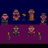
Much better. Especially the sprites.
About your sprites, The third from the left is really good. I think that would make a very attractive battle stance posture. If I were you, I'd change the first two sprites to make them match that. |
|
| Back to top |
|
|
Orion
Sick of the shit I gotta deal with

Joined: 16 Jul 2004
Posts: 225
Location: Behind Linkmax, setting off fireworks in his hair!
|
| Posted: Thu Jul 29, 2004 12:45 pm Post subject: |
|
|
| KainMinter wrote: | Much better. Especially the sprites.
About your sprites, The third from the left is really good. I think that would make a very attractive battle stance posture. If I were you, I'd change the first two sprites to make them match that. |
Yeah I agree, but you might want to use darker colors.
The neon is blinding. 
_________________
Yo. |
|
| Back to top |
|
|
Eggie
Joined: 12 May 2003
Posts: 904
|
| Posted: Fri Jul 30, 2004 7:25 pm Post subject: |
|
|
Oh my God, this is the most amount of positive comments I ever had. I could kiss some serious lips (if you would wish that.)
| Quote: | | =MCW Go back to studying clothing folds.. because they're terrible. (they're pretty good on the shirt though) |
Yeah, I am trying to get better on that. That is my priority (I don't believe I spelt that right.) I have been looking on anime, but I keep on coming along hentai, and there's no clothes there! (Well, there's some.)
My second priority is proportion. I have always been bad at that no matter what I use it in. I'll try to get my groove on with that sometime soon. I do see that the thumbs are too skinny and long. Need to short and fat.
Yeah, and the werelion's supposed to be weak, 'cause he's a big pussy (No. Seriously. He's a pretty "BIG" "PUSSY"cat. Teehee.) He's supposed to be weak.
And I will try to make all my other sprites like the third from the left (As Kain Pointed out.)
And of course I will use darker colours, 'cause the neon is startng to get to me too. Though, I do like the fact I made neonic sprites. |
|
| Back to top |
|
|
|


