| View previous topic :: View next topic |
| Author |
Message |
Velduanga
I heard there were bagels here...
Joined: 25 Jul 2003
Posts: 112
Location: A town away from White Owl, I kid you not, unless he moved.
|
 Posted: Thu Dec 16, 2004 12:27 am Post subject: Concept arts for my latest game project Posted: Thu Dec 16, 2004 12:27 am Post subject: Concept arts for my latest game project |
 |
|
Hi everyone. Wanted to show everyone the finalized character concept drawings I made for my current game project, "Vicious Infinity". Premise of the game is a almost free-ranged RPG, where ally heroes are completely optional. Questions or comments welcome.

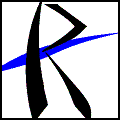
The main logo of the game
 
The main hero and enemy. In the most basic sense, story is Riot steals something of Remmy's, the entire game consists of her chasing him down.


The various ally heroes that you can come across.
 
 
The various antagonists, and Vera.
Most of you are probably wondering, those are descriptionate personal titles all the characters have.
Again, questions and comments welcome.
_________________
If you hit a plane with the soccer, could you afford to fix it? - Shaolin Soccer
"If it's worth shooting, it's worth shooting twice"-Tom Clancy

Last edited by Velduanga on Thu Dec 16, 2004 1:09 am; edited 1 time in total |
|
| Back to top |
|
 |
Gizmog1
Don't Lurk In The Bushes!
Joined: 05 Mar 2003
Posts: 2257
Location: Lurking In The Bushes!
|
| Posted: Thu Dec 16, 2004 12:42 am Post subject: |
|
|
| Ki the enchantment indeed. Sexiest thing I've seen you draw in a while. I really kinda like the style of these. Looking forward to seeing the actual game, though, I wonder how well this many colors are going to import. |
|
| Back to top |
|
|
Uncommon
His legend will never die

Joined: 10 Mar 2003
Posts: 2503
|
| Posted: Thu Dec 16, 2004 2:14 am Post subject: |
|
|
Fayrce's legs look a bit long and his colors clash badly.
The only drawings here that strike me as rather interesting are Vera (despite...unlikely hair) and the Unbeliever. The others are a tad too static for my tastes (though Agion is close).
Not a whole lot of commenting to do on the designs. They look a little overdone, but that's just my take. |
|
| Back to top |
|
|
AdrianX
..yeah.
Joined: 13 Feb 2003
Posts: 286
Location: Batangas City,Philippines
|
| Posted: Thu Dec 16, 2004 3:36 am Post subject: |
|
|
..heh..what can i say?it's Velduanga...very,very nice..keep it up!..don't take critizism seriously unless you know that they can do better.
i await the game! |
|
| Back to top |
|
|
Leonhart

Joined: 25 Feb 2004
Posts: 383
Location: Philippines
|
| Posted: Thu Dec 16, 2004 3:55 am Post subject: |
|
|
Wow, Veldy, people will give anything just to have your talent.
*keeps eyes glued to the screen for an hour
_________________
The man who smiles when things go wrong has thought of someone to blame it on.
- Robert Bloch |
|
| Back to top |
|
|
Fortis
don't make me come over there

Joined: 22 Jun 2003
Posts: 72
Location: Portland
|
| Posted: Thu Dec 16, 2004 4:27 am Post subject: |
|
|
Actual criticism ahead:
The arms are a bit short. Or the legs are a bit long, I'm not sure which.
The tips of the fingers generally fall just above the knee.
Also, ankles... the connection between the lower leg & ankle is not as thick as the lower leg itself. It gets a bit thinner around the joint. The way you have it now they look kind of like Megaman feet.
Those are pretty original job (I'm assuming they're job) names. Pacificator doesn't sound too good to me, though, and .. Simper?
_________________
ARRRR, GLADYS! CHALK IT, DON'T PLEASURE IT |
|
| Back to top |
|
|
AdrianX
..yeah.
Joined: 13 Feb 2003
Posts: 286
Location: Batangas City,Philippines
|
| Posted: Thu Dec 16, 2004 5:28 am Post subject: |
|
|
| Fortis wrote: | Actual criticism ahead:
The way you have it now they look kind of like Megaman feet.
|
..i think it's intentional.most of Veld's (and mine) artworks have body frameworks similar to megaman's. |
|
| Back to top |
|
|
LeRoy_Leo
Project manager
Class S Minstrel
Joined: 24 Sep 2003
Posts: 2683
Location: The dead-center of your brain!
|
| Posted: Thu Dec 16, 2004 5:42 am Post subject: |
|
|
I'd like to comment on your designs. I love the way you used the ancient symbol for eternity (sideways 8 ).
The only thing that bothers me is how slender these guys are. When I say skinny, I mean SCRAWNY. I could beat these guys by blowing on them. But it's cool. It's all just the style, and people don't seem to mind it, so it's all good. I guess that's as skinny as one can become and still fit one's internal organs inside themselves.
_________________
Planning Project Blood Summons, an MMORPG which will incinerate all of the others with it's sheer brilliance...
---msw188 ---
"Seriously James, you keep rolling out the awesome like gingerbread men on a horror-movie assembly line. "
Last edited by LeRoy_Leo on Thu Dec 16, 2004 11:05 am; edited 1 time in total |
|
| Back to top |
|
|
Me
HI.
Joined: 30 Mar 2003
Posts: 870
Location: MY CUSTOM TITLE CAME BACK
|
| Posted: Thu Dec 16, 2004 8:53 am Post subject: |
|
|
I like most of these, the coloring is attractive, nice and gentle on the eyes. Only thing I can think of right now is that Mochter the Dark looks rather uninteresting and emaciated.
_________________
UP DOWN UP DOWN LEFT LEFT RIGHT RIGHT A B START |
|
| Back to top |
|
|
Moogle1
Scourge of the Seas
Halloween 2006 Creativity Winner


Joined: 15 Jul 2004
Posts: 3377
Location: Seattle, WA
|
| Posted: Thu Dec 16, 2004 9:02 am Post subject: |
|
|
| LeRoy_Leo wrote: | | I'd like to comment on your designs. I love the way you used the ancient symbol for eternity (sideways 8 ). |
Um... that's the current symbol for infinity.
Anyway, that logo is by far the best of the bunch. I don't care for the name, as it seems like just another no-meaning generic RPG name ("Kingdom Hearts!" "Breath of Fire!" "Sword of Jade!"), but it could be the case that it's actually quite meaningful. If that's the case, disregard previous sentence.
_________________
|
|
| Back to top |
|
|
LeRoy_Leo
Project manager
Class S Minstrel
Joined: 24 Sep 2003
Posts: 2683
Location: The dead-center of your brain!
|
| Posted: Thu Dec 16, 2004 11:12 am Post subject: |
|
|
| Moogle1 wrote: | | LeRoy_Leo wrote: | | I'd like to comment on your designs. I love the way you used the ancient symbol for eternity (sideways 8 ). |
Um... that's the current symbol for infinity. |
My bad. o.o
I forgot to mention that I really think the "unbeliever"'s pose is great. that's an interesting action stance. I honestly can't say I have seen that as often as some of the others you have here. 
/me gets that look in his eyes again*
*stealstealstealsteal*
_________________
Planning Project Blood Summons, an MMORPG which will incinerate all of the others with it's sheer brilliance...
---msw188 ---
"Seriously James, you keep rolling out the awesome like gingerbread men on a horror-movie assembly line. " |
|
| Back to top |
|
|
Iblis
Ghost Cat

Joined: 26 May 2003
Posts: 1233
Location: Your brain
|
| Posted: Thu Dec 16, 2004 1:27 pm Post subject: |
|
|
| Quote: | | don't take critizism seriously unless you know that they can do better. |
This is some of the worst advice you can take as an artist.
On to the actual art, now. I rather like Embat the Dealer. The pose and design are simple, but I think it looks pretty cool. Your art is better when you're not trying any sort of action pose, I think.
The hair on some of these (Remmy, Vera, Zachio, Ki) is bizarre even by anime standards. Personally I think it doesn't look good, but it could just be me.
As has been already said, the Unbeliever looks pretty freaking cool. It's definitely the best one in the bunch.
Lastly, how does "Serpent Planet Eater" make sense? He eats serpent planets? He's a serpent who eats planets? What?
_________________
Locked
OHR Piano |
|
| Back to top |
|
|
Setu_Firestorm
Music Composer

Joined: 26 Mar 2003
Posts: 2566
Location: Holiday. FL
|
|
| Back to top |
|
|
RPGCreations
E Pluribus Unum
Joined: 18 May 2003
Posts: 345
|
| Posted: Thu Dec 16, 2004 3:12 pm Post subject: |
|
|
Kingdom Hearts: Haven't played it, but I assume it deals with disney's magical kingdom and the heart of characters.
Breath of Fire: Metonymy for Dragon, and it deals with dragon folklore
Sword of Jade: There is an actual sword of jade within the rpg, and it deals with jaded characters, some of whom are bitter
Vicious Infinity: It appears to deal with a vicious cycle of death and birth upon looking at the contrasting sides of the closed helix or the snake attempting to eat itself
Final Fantasy: no-meaning generic rpg name (joking, though its title's connection to its content is far more abstract and loose than your examples)
Anyway, the designs are colorful and illustrate a happy and fun story world. Such a world will not be to the tastes of bitter tongues. Expanding on AdrianX's sentiments, bitter people will dislike you for producing more awesome work than their own. Everyone, including them, knows you have made something good when their reaction is to unintelligibly poo-poo trivial aspects of it. Aevio the wanderer is my favorite design (minus unnecessary cut in shirt), and Count Riot the dreadgiver is my favorite title. Technically, I prefer darker and more solid outlines for contrast, but your method works fine with blank backgrounds and with your use of highlights.
_________________
 |
|
| Back to top |
|
|
Joe Man
Joined: 21 Jan 2004
Posts: 742
Location: S. Latitude 47°9', W. Longitude 123°43'
|
| Posted: Thu Dec 16, 2004 4:01 pm Post subject: |
|
|
Final Fantasy: Square's last chance before going bankrupt. The company was quite unsucessful, and had to either make a big hit or go out of buisness, so they naturally expected their new project to be their last, thus the "Final". The fantasy came because this game was, in fact, a fantasy.
_________________
"Everyone has 200,000 bad drawings in them, the sooner you get them out the better."
~Charles Martin Jones
Last edited by Joe Man on Fri Dec 13, 1957 1:21 am; edited 2,892 time in total
Last edited by Joe Man on Fri Dec 17, 2004 3:25 pm; edited 1 time in total |
|
| Back to top |
|
|
|


