| View previous topic :: View next topic |
| Author |
Message |
LeRoy_Leo
Project manager
Class S Minstrel

Joined: 24 Sep 2003
Posts: 2683
Location: The dead-center of your brain!
|
 Posted: Sun Feb 06, 2005 4:14 pm Post subject: I don't have to wish I was you... Posted: Sun Feb 06, 2005 4:14 pm Post subject: I don't have to wish I was you... |
 |
|
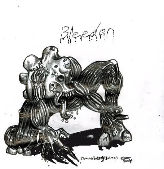
Be careful not to click... They are BIG enough as it is...
...
"So vile that they need to rip the eyes out of a mortal from this realm and use them in order to see here, but in Hell their sight is as keen as a light."
~Waruden. Dark Emblem.
...
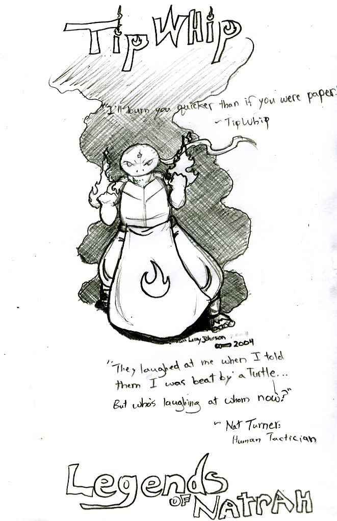
"Super fireball kick combo!  " "
~TipWhip, Tiptype knight of Natrah.
Legends of Natrah.
...
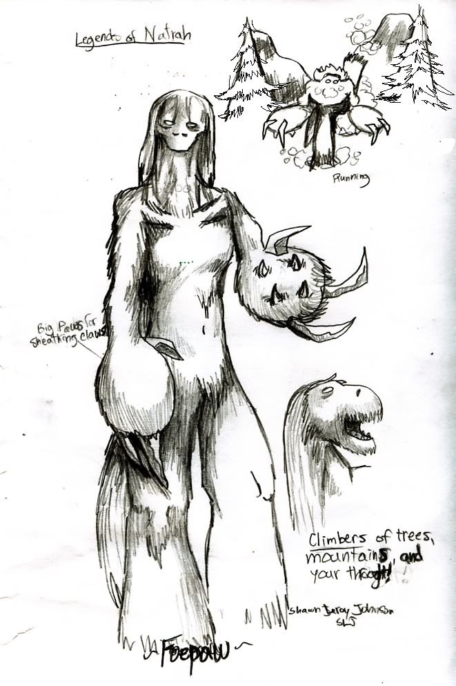
"They climb trees, steep mountain faces, cliffs, and your throat fast enough that there is no use trying to escape. One might as well run toward them."
~Dr. Z. Huff. legends of Natrah.
...
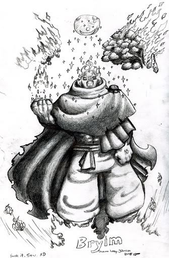
"There is never such thing as failure. Only change of plans."
~Former leader of the Bureau of Bandits. Killed and succeeded by Bryimm...
Legends of Natrah.
Hmmmm...
_________________
Planning Project Blood Summons, an MMORPG which will incinerate all of the others with it's sheer brilliance...
---msw188 ---
"Seriously James, you keep rolling out the awesome like gingerbread men on a horror-movie assembly line. "
Last edited by LeRoy_Leo on Sun Feb 06, 2005 4:42 pm; edited 1 time in total |
|
| Back to top |
|
 |
Iblis
Ghost Cat

Joined: 26 May 2003
Posts: 1233
Location: Your brain
|
| Posted: Sun Feb 06, 2005 4:31 pm Post subject: |
|
|
Whoa! This is all really cool. That first thing is really creepy and horrible looking (in a good way). I can't quite discern its overall shape though.
The TipWhip pic is the least impressive one to me. I still like it, but it doesn't have the same effect as the others.
The climber thing is awesome. I like the huge claws on the outside and the smaller ones on the palm. Good face too. I like the fur texture a lot. This one is my favorite I think.
The last one is good too. I really like the shading on the cloak/cape thing and his pants. The fire looks great too. |
|
| Back to top |
|
|
Joe Man
Joined: 21 Jan 2004
Posts: 742
Location: S. Latitude 47°9', W. Longitude 123°43'
|
| Posted: Sun Feb 06, 2005 4:49 pm Post subject: |
|
|
I don't have to wish I were you either (I do wish I were less lazy, though).
_________________
"Everyone has 200,000 bad drawings in them, the sooner you get them out the better."
~Charles Martin Jones
Last edited by Joe Man on Fri Dec 13, 1957 1:21 am; edited 2,892 time in total |
|
| Back to top |
|
|
Jack
the fool

Joined: 30 Jul 2004
Posts: 773
|
| Posted: Sun Feb 06, 2005 5:49 pm Post subject: |
|
|
on the hands on the tipwhip picture are messed up if im seeing it right. if the back of the hands are facing us, the thumbs should be on the opposite side. other than that its a pretty good picture but not as good as the others.
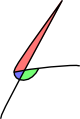
i love the foepaw pic, its pretty beastly and the shading is very nice. where he's "running" in the upper right it looks a bit wierd, his leg looks like its flat against his back.
bryim looks pretty nasty as well, again excellent shading especially on that cloak. only thing i dont like about him is his head, it just looks a bit corny from what i can see. |
|
| Back to top |
|
|
Me
HI.
Joined: 30 Mar 2003
Posts: 870
Location: MY CUSTOM TITLE CAME BACK
|
| Posted: Sun Feb 06, 2005 6:57 pm Post subject: |
|
|
I really like your art. Incredibly imaginative, even if TipWip is obviously a TOTAL NINJA TURTLES RIPOFF :(( but anyway, great looking. There are a few technical/anotomical problems: in many cases, your characters arms look far to small, especially when they are holding them like TipWip is here. I personally think Bryim's fists should be enlarged to epic proportions, because that would be awesome. The Breeder and the (can't read the name too well) Foepaw look very very good. To top all this off, I don't see any generic anime in there at all.
_________________
UP DOWN UP DOWN LEFT LEFT RIGHT RIGHT A B START |
|
| Back to top |
|
|
Uncommon
His legend will never die

Joined: 10 Mar 2003
Posts: 2503
|
| Posted: Sun Feb 06, 2005 7:07 pm Post subject: |
|
|
First let me say that the shading and texturing is excellent on all of them, but sometimes the anatomy and perspective is just a bit off.
The Bleeder's arms seem stiff, and the way the right leg is bent just looks wrong.
It's already been pointed out that TipWhip's thumbs are backwards.
The perspective on the Foepaw's left arm is rather awkward. Also, the movement in running picture looks strange and unbelievable. Nice trees, though.
I have no real qualms with Bryim, except that his left arm looks stiff and makes the rest of the picture look rather static. Also, those're some weird wrinkles in his pants.
All in all I'm pleasantly surprised. You're not bad at drawing characters with detailed and stylish skins, if you could just work on those skeletons, you'd be great.
Though I didn't care for the first three of your quotes. At all. The last one implies a rather clever character, until you have to go and spoil our hopes for that character by telling us that we was killed and succeeded by the guy in the picture above. >:( |
|
| Back to top |
|
|
Setu_Firestorm
Music Composer

Joined: 26 Mar 2003
Posts: 2566
Location: Holiday. FL
|
|
| Back to top |
|
|
LeRoy_Leo
Project manager
Class S Minstrel
Joined: 24 Sep 2003
Posts: 2683
Location: The dead-center of your brain!
|
| Posted: Thu Feb 10, 2005 7:24 pm Post subject: |
|
|
I would like to say thanks to everyone who commented (so far). Let me run down my list of things I have learned.
I agree that most of my anatomy needs a lot of work. Thank you all for the tips.
What I have learned:
1) The Bleeder: Sorry if his name is hard to read. I thought it would be a nice touch to make its name drippy with blood. And I really shouldn't have made this guy so dry. He could have been oozing blood or something. At least that was how he should have been intended, being skinless and all.
And thanks, Uncy, the leg is badly bent. I will watch out next time. I built this drawing from the inside out instead of outlining it. That may have messed it up.
2)TipWhip: My my. The thumbs are switched... <Napoleon Dynamite> Gosh!</Napoleon Dynamite> There is just NO excuse for THAT... I took a second look at this and I can't believe I let THAT slip. So ashamed… Anyway, it is a little out of place in this line up. It wasn't a detailed picture of him, but rather a sketch of a pose from him. This may explain why it was lacking that same “feelâ€. I appreciate you pointing that out to me. Shortly after I looked at this I noted that the words (quote) within the picture sort of drive attention away as well. I will have to move all quotes on the picture to the side from now on, as they are not really important to anyone but me.
3)FoePaw: Thanks for the awesome comments, guys. The fur texture, I feel, was the worst part about it. I am glad you didn't mind that part of its other leg didn't go through the scanner correctly (after several tries I said “screw itâ€). I agree that the running sample in the corner was way off. I need way more practice with animation. Anyway, a foepaw is a beast in Legends of Natrah, a future game which TurtleQuest was supposed to be somewhat based on.
4)Bryimm: I forgot an 'M' in his name when I drew this. *smacks forehead again* But that's not one of the big deals here. I tried to make him as angry as I could for this pose. His face does look off, though. His hands should definitely be bigger. In fact, they were meant to be. I am glad we sort of think alike, Rubs. And the pants folds DO reek. Those are not the kind of folds that I like either. I must have been tired... And sorry to disappoint you, Unc. You'll see. This guy's exploits should be more than worth the death of one clever old man.
Setu: Thank you. I try to be different. And you ain’t seen nothin’ yet. Keep it real ‘til next crime, bro.
A big thank you once again for what comments I got so far. The reason why I will post my stuff once in a while is to spot errors like this. I hope I can get a little more feedback before my next update… We might spot something new, and it would help me out a lot. It may even help a critic spot things in the furture, so keep those eyes open... and watch out for that Bleeder (definite name change consideration.  ). ).
_________________
Planning Project Blood Summons, an MMORPG which will incinerate all of the others with it's sheer brilliance...
---msw188 ---
"Seriously James, you keep rolling out the awesome like gingerbread men on a horror-movie assembly line. " |
|
| Back to top |
|
|
Tsunamidog
banned...but not really.

Joined: 14 Sep 2004
Posts: 330
Location: right behind you....
|
| Posted: Sat Feb 12, 2005 8:33 pm Post subject: |
|
|
| Setu_Firestorm wrote: | | Holy fashizzle. That is some kickass designing skills. |
Setu's pimpin'.
Anyway, the artwlork looks really good, and all it really does for me is makes me mad that I can't draw that good. 
_________________
The Following Statement is True.
The Above Statement Is False |
|
| Back to top |
|
|
|


