| View previous topic :: View next topic |
| Author |
Message |
Leo
The wizard of many faces...

Joined: 02 Nov 2004
Posts: 95
Location: Way far up north in Sweden...
|
 Posted: Sun Apr 03, 2005 8:24 am Post subject: Some screenshots Posted: Sun Apr 03, 2005 8:24 am Post subject: Some screenshots |
 |
|
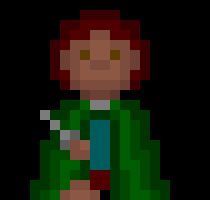
Since the work on Zander is going a bit slow, I have started working on a new game in which I have put some more work into the graphics. So tell me what you think.
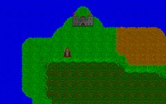
Our hero outside the castle:
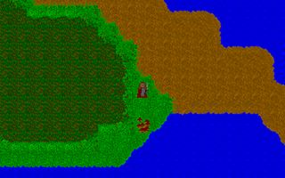
Ah! A village to rest in.
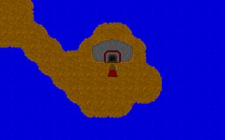
Hmmm... A cave.
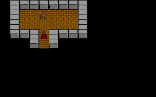
The tiles on this one is from Zander. The purpose of this picture is to show the farmer guy.
A close look on the main hero.

This a try of drawing a more big-headed walkabout than I use to.
_________________
"A common mistake that people make when trying to design something completely foolproof is to underestimate the ingenuity of complete fools."
-Douglas Adams
Download Zander (Swedish)
or Zander (English) |
|
| Back to top |
|
 |
Jack
the fool

Joined: 30 Jul 2004
Posts: 773
|
| Posted: Sun Apr 03, 2005 11:26 am Post subject: |
|
|
they look to be a great improvement from zander, and from what i can see they are fairly good graphics. i really like the walkabouts, no longer are they all blocky with no shading.
only thing is, the bmp seems to be throwing things off, but from what i can see the maptiles look pretty good. the castle looks fantastic as well.
excellente'
_________________
 |
|
| Back to top |
|
|
Leo
The wizard of many faces...
Joined: 02 Nov 2004
Posts: 95
Location: Way far up north in Sweden...
|
| Posted: Mon Apr 04, 2005 9:01 am Post subject: |
|
|
Thanks, but what style of walkabout should I use? Myself, I prefer the more proportional one, but with a big-head you can fit more shades and details...
_________________
"A common mistake that people make when trying to design something completely foolproof is to underestimate the ingenuity of complete fools."
-Douglas Adams
Download Zander (Swedish)
or Zander (English) |
|
| Back to top |
|
|
rpgspotKahn
Lets see...
Joined: 16 May 2004
Posts: 720
Location: South Africa
|
| Posted: Mon Apr 04, 2005 10:07 am Post subject: |
|
|
They are looking nice. That castle is a real brilliant peice.
About the walkabouts - I think you should not make a walkabout abruptly stop at the bottom of the pixel area. The only pixels present on the last line of pixels should be the tips of shoes or toes. When a walkabout ends so suddenly is seems when you are playing the game that the hero still has much more body to him that has just been cut off.
The actual walkabout looks great. Just design it in a way that it prevents the above effect.
the world walk reminds me of old FF games. Then again... many OHR games do.
_________________

2nd Edition out now! |
|
| Back to top |
|
|
TMC
On the Verge of Insanity
Joined: 05 Apr 2003
Posts: 3240
Location: Matakana
|
| Posted: Tue Apr 05, 2005 1:28 am Post subject: |
|
|
The screenshots don't look bad as such, but the maps are plain and boring. There is little substance to them - they are just vividly coloured open spaces. The town looks tiny in a huge area of colour. Of course, this is a problem with very many overworld maps. Of course, I admit that you are just starting this game, so you might not have put much to put on the map yet, or have spent long on it.
Try and get rid of the grid effect, then the maps are more likely to look like land rather than blobs of colour. The tiles are not bad otherwise, besides showing little.
_________________
"It is so great it is insanely great." |
|
| Back to top |
|
|
|

