 |
Castle Paradox
|
| View previous topic :: View next topic |
| Author |
Message |
TwinHamster
♫ Furious souls, burn eternally! ♫
Joined: 07 Mar 2004
Posts: 1352
|
 Posted: Fri May 20, 2005 2:36 pm Post subject: Darkmoon: Seventh try Posted: Fri May 20, 2005 2:36 pm Post subject: Darkmoon: Seventh try |
 |
|
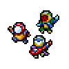
After working on various little games after the last Darkmoon Update, I've decided to remake Darkmoon, because it would be even harder to edit the game. So, here are some screen shots.

Worked on the walkabouts.

New title screen

A few more puzzles and things.
*Considering the fact that the previous one didn't have any.*

Oh snaps! Three framed "..."!

Battles? Better.
Tell me what you think, and the better the response, the more motivation I receive to work harder. |
|
| Back to top |
|
 |
SilentAngel
The Angel of Silence

Joined: 16 Dec 2003
Posts: 122
Location: The comfiest chair in #CastleParadox
|
| Posted: Fri May 20, 2005 3:51 pm Post subject: |
|
|
First screenshot: The walkabouts are improved from the previous version, and are more appealing.
They're fairly simple in design, but look nice regardless. Although, I'd suggest that with the map
itself, try and add some variety. For example, making the cliffface less "square" and adding
"diagonal" parts to it, giving the illusion that the cliff is irregular.
Also try to make the stairs smaller (unless large stairs are your intent) and try to blend them into
the cliffface, such as putting a shadow near the cliffface to indicate that they're "embedded"
into the rock.
Second screenshot: Simple title screen, doesn't detract due to too much "activity" on the screen.
Does the purple sphere have any significance to the game itself? Perhaps the elusive fifth element
in the previous game?
Third screenshot: The puzzle rocks could do with a little more detail/contrast to make them look a
little more like rocks. However, they look decent now, so it's your choice.
Fourth screenshot: If you have any extra room in your tileset, you should perhaps make "corners"
for the outline of the room itself, so it looks more "finished". You could also make it a neutral colour
so that it doesn't detract from the interior itself, and also, you may be able to reuse the borders,
but that's up to you. Also, the chair is straight-on, but the table is on an angle. If you place the
table straight-on too, you can make the table look bigger in comparison to the chair.
Other than that, a good job with the interior.
Fifth screenshot: Did you create that background yourself? It's simple, but if you could add a little
more detail to it, it would make it look even better. For example, rocks, patches of grass,
whatever you want. The battle graphics reflect the walkabout graphics, which is a good thing.
However, with the enemy graphics the green blob "Glone" isn't outlined in a dark colour, but the
other enemies are. Is this intentional? It might look better if you change all the enemy graphics
into the same style (either outlined, or not outlined).
All in all, you've improved from the last time, but there's still some things which might need
changing. I look forward to seeing the end product. 
_________________
Current Projects:
Hikari no Senshi - Inperiaru Taisen: ~10% Complete
http://www.castleparadox.com/forum/download.php?game=392
Stepmania Online Stats:

Next song to pass on Stepmania: Paranoia Survivor Max (Heavy)
Next song to pass on DDR: MaxX Unlimited(Standard)
|
|
| Back to top |
|
|
Tsunamidog
banned...but not really.

Joined: 14 Sep 2004
Posts: 330
Location: right behind you....
|
| Posted: Sun May 22, 2005 3:21 pm Post subject: |
|
|
They do look better. I agree, you could use corners, andsome more details on the rocks, but there still not bad.
_________________
The Following Statement is True.
The Above Statement Is False |
|
| Back to top |
|
|
Phil Arts
Manipulating himself since the beginning
Joined: 14 Jul 2004
Posts: 251
|
| Posted: Wed May 25, 2005 10:23 am Post subject: |
|
|
As Tsunamidog said, you use a lot more details than the orignal.
The title screen is too plain, I like the original title better.
but other than that, I cant wait when your remake comes out  |
|
| Back to top |
|
|
Linkmax
I'm an idiot.
Joined: 03 Feb 2003
Posts: 202
Location: Oly
|
| Posted: Wed May 25, 2005 10:40 am Post subject: |
|
|
| Not too bad, good job. Can't wait to see the game. |
|
| Back to top |
|
|
Setu_Firestorm
Music Composer

Joined: 26 Mar 2003
Posts: 2566
Location: Holiday. FL
|
| Posted: Thu May 26, 2005 11:13 am Post subject: |
|
|
While it's pretty good, I have to point out that I'm noticing an inconsistency in the pixelart style. Some things try to look photorealistic while others take on an airbrush look.
Not that I'm one to talk, but I think you should decide how your tiles are going to be and stick with that one style. Other than that, it looks promising.
_________________

Facebook: http://www.facebook.com/georgerpowell
Newgrounds: http://setu-firestorm.newgrounds.com |
|
| Back to top |
|
|
Orion
Sick of the shit I gotta deal with

Joined: 16 Jul 2004
Posts: 225
Location: Behind Linkmax, setting off fireworks in his hair!
|
| Posted: Thu May 26, 2005 7:19 pm Post subject: |
|
|
Those look alright. A bit airbrushy, but good enough for me. Good luck with your game amigo!
_________________
Yo. |
|
| Back to top |
|
|
TwinHamster
♫ Furious souls, burn eternally! ♫
Joined: 07 Mar 2004
Posts: 1352
|
| Posted: Mon May 30, 2005 3:35 am Post subject: |
|
|
SilentAngel:
-Second Screenshot) The whole reason I wanted to remake the game again was because of the weak story. It now involves...more stuffs. But the purple sphere is actually supposed to represent the actual "Dark Moon".
-Third Screenshot) The rocks actually have more than one color, but they kind of lost them when the screenshot was turned into .jpeg format.
-Fifth screenshot)
-The glone had an outline in the original game, but when I Ysoft's Graphics extractor, the backround was the same shade of black as the outline of the glone. So I just decided it was easier to leave it that way instead of retracing the glone.
Airbrushy stuff:
When working on backdrops, I either use Pixia or the Gimp. Pixia gives the backdrops the airbrushy fell, and Gimp gives the backdrop it's pixelated fomat. So the backdrops are going to be Pixia or Gimp. Personally, I like the Backdrops made with the Gimp, because they come out nicer. But I downloaded it onto my basement computer, which won't turn on unless you push the on/off switch a multiple number of times.
So basically, the airbrush backdrops are a result of laziness.
Tiles:
In the game, you're going to be seeing pixelated (as in able to see individual pixels and stuff) or the airbrush stuff. Again with the pixia and gimp matter, but I usually use PaintBrush to make the individual tiles.
And thanks for the opinions.
*Wow... People actually played the first one.* |
|
| Back to top |
|
|
|
|
You cannot post new topics in this forum
You cannot reply to topics in this forum
You cannot edit your posts in this forum
You cannot delete your posts in this forum
You cannot vote in polls in this forum
|
Powered by phpBB © 2001, 2005 phpBB Group
|

