| View previous topic :: View next topic |
| Author |
Message |
LongeBane

Joined: 03 Feb 2003
Posts: 312
Location: Tomorrow
|
 Posted: Sat Jan 07, 2006 4:47 pm Post subject: my second drawing, more crappiness? or sexiness! Posted: Sat Jan 07, 2006 4:47 pm Post subject: my second drawing, more crappiness? or sexiness! |
 |
|
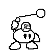
I've embarked on another drawing! Look below:


All I have left to do now is color in that towel-thing.
Btw, The hardest part was the hair. |
|
| Back to top |
|
 |
KainMinter
*~*

Joined: 10 Jan 2004
Posts: 155
Location: Austin
|
| Posted: Sat Jan 07, 2006 5:47 pm Post subject: |
|
|
| Looks nice. You've got the female form down pretty well in both of your drawings. |
|
| Back to top |
|
|
Moogle1
Scourge of the Seas
Halloween 2006 Creativity Winner


Joined: 15 Jul 2004
Posts: 3377
Location: Seattle, WA
|
| Posted: Sat Jan 07, 2006 5:49 pm Post subject: |
|
|
The hips are too wide and the legs don't narrow quickly enough. Her right arm is also doing something weird and the placement of the finger is awkward. Face and upper body are quite nice, though.
_________________
|
|
| Back to top |
|
|
LongeBane
Joined: 03 Feb 2003
Posts: 312
Location: Tomorrow
|
| Posted: Sat Jan 07, 2006 6:00 pm Post subject: |
|
|
| The exaggerated hips were for effect. I think the body looks nicer with more of a curve-like nature. And your body can only curve so much in real life, so art is the opportunity to bring out the highlights of the female body. |
|
| Back to top |
|
|
DomGallo
Is a master. And you?
Joined: 18 Nov 2005
Posts: 85
Location: COMING THROUGH YOUR BATHROOM WINDOW
|
| Posted: Sat Jan 07, 2006 6:31 pm Post subject: |
|
|
Is it me or is her vagina crooked?
_________________
The turkey: God's most noble creature.
Don't eat Turkey for Christmas. I WILL FIND OUT. |
|
| Back to top |
|
|
LeRoy_Leo
Project manager
Class S Minstrel
Joined: 24 Sep 2003
Posts: 2683
Location: The dead-center of your brain!
|
| Posted: Mon Jan 09, 2006 10:03 pm Post subject: |
|
|
Looks to me like her suit is hanging down there between her legs. In reality, there would be a little more space between her legs.
Since I am aweful with words, let me scrounge up an example of what I mean by a little more space between her legs.
Warning: Not work safe.
Disclaimer: This is for the artist's benefit and was not intended to hijack the thread, so keep your comments to PMs.
http://img.photobucket.com/albums/v706/ShawnLeroy/Anthro/Notworksafe.jpg
It's not perfect, but the area I wanted to show is there. 
As for the rest of this; AWESOME JOB, man.
Looks like you sort of figured out how to make the eyes with whites...
Personally, I prefered the first style.
_________________
Planning Project Blood Summons, an MMORPG which will incinerate all of the others with it's sheer brilliance...
---msw188 ---
"Seriously James, you keep rolling out the awesome like gingerbread men on a horror-movie assembly line. " |
|
| Back to top |
|
|
Phil Arts
Manipulating himself since the beginning
Joined: 14 Jul 2004
Posts: 251
|
| Posted: Tue Jan 10, 2006 7:12 am Post subject: |
|
|
| Better than your first drawing but her hair and face looks a little weird. |
|
| Back to top |
|
|
Zombie Hunter Green
Keeps on picking the Rayon Launcher

Joined: 15 Oct 2004
Posts: 191
|
| Posted: Wed Jan 11, 2006 7:37 am Post subject: |
|
|
| You're just copying these out of "how to draw manga". |
|
| Back to top |
|
|
|

