| View previous topic :: View next topic |
| Author |
Message |
Battleblaze
Warrior Thread Monk

Joined: 19 Dec 2003
Posts: 782
Location: IndY OHR
|
 Posted: Wed Mar 15, 2006 7:38 am Post subject: Posted: Wed Mar 15, 2006 7:38 am Post subject: |
 |
|

This has so far taken 2 days. I still dont feel like I'm done.This might be the single best picture I've ever done. The pose was clearly inspired form gone with the wind. Two days ago my hopeless romanticness started acting up and thus came the inspiration for the picture. I think I'll use this as the backround for my myspace. Love to Love kids. And the carppy poem was my own (ditto with the mild amusing one liner).
_________________
Indy OHR! and National OHR Month Contest going on now!
"Aeth calls PHC an anti-semite; PHC blames anti-semitism"
-squall |
|
| Back to top |
|
 |
LeRoy_Leo
Project manager
Class S Minstrel

Joined: 24 Sep 2003
Posts: 2683
Location: The dead-center of your brain!
|
 Posted: Wed Mar 15, 2006 11:41 am Post subject: Posted: Wed Mar 15, 2006 11:41 am Post subject: |
 |
|
Pretty. And I'm glad you didn't put a lense flare in this time. 
The sun/star/shiney thing in the top right is pretty cool.
The slogan, "Get carried away" works well.
You might try this. Try adding a new color adjustment layer over the others and adjust the colors to some sort of Cyan, which will create a blueish atmosphere and make the artwork look more like it fits in the picture. You could also make a new layer with solid blue over the art work and put a transparency on it, or just change the mode to overlay to create a sort of blue hue over the whole piece.
Just some suggestions/thaughts you might have fun with.
Need I explain?
_________________
Planning Project Blood Summons, an MMORPG which will incinerate all of the others with it's sheer brilliance...
---msw188 ---
"Seriously James, you keep rolling out the awesome like gingerbread men on a horror-movie assembly line. " |
|
| Back to top |
|
 |
Battleblaze
Warrior Thread Monk

Joined: 19 Dec 2003
Posts: 782
Location: IndY OHR
|
 Posted: Wed Mar 15, 2006 2:19 pm Post subject: Posted: Wed Mar 15, 2006 2:19 pm Post subject: |
 |
|
In PaintShopProX theres a thing wre u can make the colors appear hotter or colder.I fooled with it abit but it kinda thew off the feel. To me its like Love should be the warmer color and in full volume. And the theme of the art is that even though things go wrong (earth blows up lol) I'll always love you. So the contrasting colors actually work pretty well in that sense.
The part thats like a huge fireball is supposed to be the moon blowing up (sending tons of asteriod to kill us all  ) But it was hard to draw the moon in a realistic sense while its exploding. I remember this scene in the modern movie adaption of "The Time Machine" where the moon was collapsing and I thought it was beautiful in a creepy (o shit) kinda way. I wanted to find that picture but never could ) But it was hard to draw the moon in a realistic sense while its exploding. I remember this scene in the modern movie adaption of "The Time Machine" where the moon was collapsing and I thought it was beautiful in a creepy (o shit) kinda way. I wanted to find that picture but never could 
_________________
Indy OHR! and National OHR Month Contest going on now!
"Aeth calls PHC an anti-semite; PHC blames anti-semitism"
-squall |
|
| Back to top |
|
 |
LongeBane

Joined: 03 Feb 2003
Posts: 312
Location: Tomorrow
|
 Posted: Wed Mar 15, 2006 8:23 pm Post subject: Posted: Wed Mar 15, 2006 8:23 pm Post subject: |
 |
|
a href="http://photobucket.com" target="_blank">
The woman's right breast seems to end kind of oddly, and there is something weird going on with the guy's shoulders. It should be a little more broad, and his right arm looks a little small, considering the width you've given it from the shoulder. No shading was done for the guy's rags. The girl's eyes don't seem to contact with the guys, it looks like its going straight up into nowhere. The guy's nose looks funny (as well as the girl's, but that could be your odd style). |
|
| Back to top |
|
 |
LeRoy_Leo
Project manager
Class S Minstrel

Joined: 24 Sep 2003
Posts: 2683
Location: The dead-center of your brain!
|
 Posted: Wed Mar 15, 2006 11:08 pm Post subject: Posted: Wed Mar 15, 2006 11:08 pm Post subject: |
 |
|
I understand what you are going for now. Good job explaining it.
You could try finding a picture of the moon and then cut it into chunks and put the explosion (which is pretty good as it is) behind it.
Come to think of it, Longebane may have a point about her breast. The cleavage seems a lttle awkwardly bent at the bottom. I've made that mistake a few times myself. 
_________________
Planning Project Blood Summons, an MMORPG which will incinerate all of the others with it's sheer brilliance...
---msw188 ---
"Seriously James, you keep rolling out the awesome like gingerbread men on a horror-movie assembly line. " |
|
| Back to top |
|
 |
Battleblaze
Warrior Thread Monk

Joined: 19 Dec 2003
Posts: 782
Location: IndY OHR
|
 Posted: Thu Mar 16, 2006 3:43 pm Post subject: Posted: Thu Mar 16, 2006 3:43 pm Post subject: |
 |
|
As for the noses that's just my odd style.I'v been thinking og of new ways to do profiling and such.
Once again I noticed her right boob could have been better.But by that time the drawing had been inked and scanned and mostly colored.it was a bit late, same goes for the rest of the body parts.But I'll keep the advice in mind for future doodles.
_________________
Indy OHR! and National OHR Month Contest going on now!
"Aeth calls PHC an anti-semite; PHC blames anti-semitism"
-squall |
|
| Back to top |
|
 |
Battleblaze
Warrior Thread Monk

Joined: 19 Dec 2003
Posts: 782
Location: IndY OHR
|
 Posted: Tue Mar 21, 2006 5:27 pm Post subject: Posted: Tue Mar 21, 2006 5:27 pm Post subject: |
 |
|

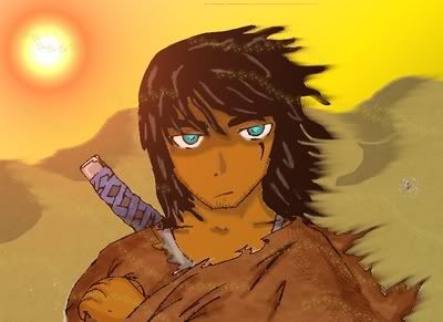
First off.THAT AINT A LENSEFLARE. I made it and added a redish overlay to look like a harsh rising sun.
This is the Steel Eyed Joe I've been talking about. In retrospect he looks like a 27ish version of me (multiply the cool x1000 and take the ADHD to zero and there I am). Due to the same event that destroyed most of earth Joe now has blue eyes and increased senses & strenth. His sword might as well be captain americas shield because its made out of an unknown, but damn strong material.
_________________
Indy OHR! and National OHR Month Contest going on now!
"Aeth calls PHC an anti-semite; PHC blames anti-semitism"
-squall |
|
| Back to top |
|
 |
LeRoy_Leo
Project manager
Class S Minstrel

Joined: 24 Sep 2003
Posts: 2683
Location: The dead-center of your brain!
|
 Posted: Tue Mar 21, 2006 9:18 pm Post subject: Posted: Tue Mar 21, 2006 9:18 pm Post subject: |
 |
|
| Battleblaze wrote: | | First off.THAT AINT A LENSEFLARE. I made it and added a redish overlay to look like a harsh rising sun. |
Awesome. I see what you did. Now the art and the background have become one, BattleBlaze san.
| Battleblaze wrote: | | This is the Steel Eyed Joe I've been talking about. In retrospect he looks like a 27ish version of me (multiply the cool x1000 and take the ADHD to zero and there I am). |
Haha. That's rich. Excellent work here. I bet you were watching last night's episode of Trigun when you drew this. One must think Wolfwood when they see the tattered brown cloth and desert adjacent. Naw, there are at least 20 distict differences. >.>
Cool wind effects.
_________________
Planning Project Blood Summons, an MMORPG which will incinerate all of the others with it's sheer brilliance...
---msw188 ---
"Seriously James, you keep rolling out the awesome like gingerbread men on a horror-movie assembly line. " |
|
| Back to top |
|
 |
Battleblaze
Warrior Thread Monk

Joined: 19 Dec 2003
Posts: 782
Location: IndY OHR
|
 Posted: Wed Mar 22, 2006 5:29 pm Post subject: Posted: Wed Mar 22, 2006 5:29 pm Post subject: |
 |
|

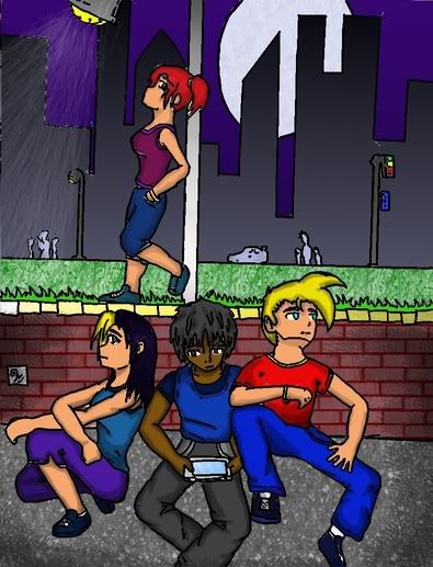
Comicbook cover for a redo of my old nutty comic book.Somewhat simlar to the TPD game I was yapping about years back. Took along time...I had some problems that you can most likely see...But I like coloring ym stuff on the old 'puter. I feel like I'm making progress by leaps and bounds (considerign I started coloring like last week).
No text yet because it'd just take up space and isn't that great anyway.
_________________
Indy OHR! and National OHR Month Contest going on now!
"Aeth calls PHC an anti-semite; PHC blames anti-semitism"
-squall |
|
| Back to top |
|
 |
Battleblaze
Warrior Thread Monk

Joined: 19 Dec 2003
Posts: 782
Location: IndY OHR
|
 Posted: Thu Mar 23, 2006 5:08 pm Post subject: Posted: Thu Mar 23, 2006 5:08 pm Post subject: |
 |
|
The lighting effect I did was pretty funky now that I look back on it... And the girl leaning on the lampost isn't small. Its supposed to be at a different perspective (farther away).
_________________
Indy OHR! and National OHR Month Contest going on now!
"Aeth calls PHC an anti-semite; PHC blames anti-semitism"
-squall |
|
| Back to top |
|
 |
The Drizzle
Who is the Drizzle?

Joined: 12 Nov 2003
Posts: 432
|
 Posted: Thu Mar 23, 2006 6:24 pm Post subject: Posted: Thu Mar 23, 2006 6:24 pm Post subject: |
 |
|
| Quote: | | And the girl leaning on the lampost isn't small. Its supposed to be at a different perspective (farther away). |
She appears to be much smaller than the others even with the distance. The reason probably is that her legs are short and stubby but her head and torso are nearly the same size as those in front of her. If she is farther from them (if the lamp is not on the edge of that little stone wall) then the her head and torso should be smaller and her legs should be thinner. If she is closer to them (the lamp post is on the edge of the wall) then her legs should be longer. I like the guy in the desert. Though I think you should consider shading the hair similar to the way you shade his face. His hair seems a little flat.
_________________
My name is...
The shake-zula, the mic rulah, the old schoola, you wanna trip? I'll bring it to yah... |
|
| Back to top |
|
 |
Moogle1
Scourge of the Seas
Halloween 2006 Creativity Winner


Joined: 15 Jul 2004
Posts: 3377
Location: Seattle, WA
|
 Posted: Thu Mar 23, 2006 9:02 pm Post subject: Posted: Thu Mar 23, 2006 9:02 pm Post subject: |
 |
|
It's still probably the best thing I've seen you do, but the lamp looks more like a shower. If you used that effect for a shower, it'd've been really impressive.
_________________
|
|
| Back to top |
|
 |
|


 ) But it was hard to draw the moon in a realistic sense