| View previous topic :: View next topic |
| Author |
Message |
Me
HI.

Joined: 30 Mar 2003
Posts: 870
Location: MY CUSTOM TITLE CAME BACK
|
 Posted: Thu May 18, 2006 1:02 pm Post subject: Posted: Thu May 18, 2006 1:02 pm Post subject: |
 |
|
Neck too long. Head tilt is weird. Neck slightly farther back than it should be. Nose ugly. Eyes a bit too high. Really, really boring.
_________________
UP DOWN UP DOWN LEFT LEFT RIGHT RIGHT A B START |
|
| Back to top |
|
 |
Moogle1
Scourge of the Seas
Halloween 2006 Creativity Winner


Joined: 15 Jul 2004
Posts: 3377
Location: Seattle, WA
|
| Posted: Thu May 18, 2006 1:36 pm Post subject: |
|
|
| Quote: | | Thats exactly what I want, but not rubbish of course. I like generic manga, you don't. Thats what makes me and you different. |
That's a horrible argument. To illustrate:
Your pictures suck, RMDR's pictures don't. That's what makes them different.
Should we celebrate this difference? Should we have appreciation for this artistic diversity? Or is this just a very poorly constructed argument?
_________________
|
|
| Back to top |
|
|
Ysoft_Entertainment
VB Programmer
Joined: 23 Sep 2003
Posts: 810
Location: Wherever There is a good game.
|
| Posted: Thu May 18, 2006 3:16 pm Post subject: |
|
|
Now moogle, how is your post constractive criticism? at least my picture is better then your Barbara.
Besides I was just playing around, those took me only 20 minutes or less to draw. I will draw better pictures once I get enough practice.
_________________
Try my OHR exporter/importer.
OHRGFX
Striving to become better pixel artist then Fenrir Lunaris. Unfortunately the laziness gets in the way of my goals. |
|
| Back to top |
|
|
Rimudora
Psychopath yandere
Halloween 2006 Creativity Winner

Joined: 26 May 2005
Posts: 335
|
| Posted: Thu May 18, 2006 3:28 pm Post subject: |
|
|
| Quote: | | Now moogle, how is your post constractive criticism? at least my picture is better then your Barbara. |
..not really. Moogle drew Barbara to ridicule your contest, and succeeded magnificently at it. You're drawing the faces to impress other people, and your pictures suck. By those standards Moogle's picture is much better than yours.
If you're not going to color your pictures, I suggest you draw them by hand and scan them, because line art is a terrible waste of computer resources.
On an unrelated note, the sig should say "striving to become a better pixel artist". "Thriving" means something entirely different. |
|
| Back to top |
|
|
Moogle1
Scourge of the Seas
Halloween 2006 Creativity Winner
Joined: 15 Jul 2004
Posts: 3377
Location: Seattle, WA
|
| Posted: Thu May 18, 2006 3:35 pm Post subject: |
|
|
Oh, that's big of you.
_________________
|
|
| Back to top |
|
|
Ysoft_Entertainment
VB Programmer
Joined: 23 Sep 2003
Posts: 810
Location: Wherever There is a good game.
|
| Posted: Thu May 18, 2006 4:39 pm Post subject: |
|
|
Rim thanks for point out the spelling error in my sig.
I just posted these pic to see what people think about them, I am not trying to impress anyone. Oh, on one more note, I cannot draw with a pencil, my coordination is messed up. So thats why I do everything on the computer.
_________________
Try my OHR exporter/importer.
OHRGFX
Striving to become better pixel artist then Fenrir Lunaris. Unfortunately the laziness gets in the way of my goals. |
|
| Back to top |
|
|
Battleblaze
Warrior Thread Monk

Joined: 19 Dec 2003
Posts: 782
Location: IndY OHR
|
| Posted: Thu May 18, 2006 5:08 pm Post subject: |
|
|
Ok Y
Ever since LOZSWOG I've had to learn to do decent mspaint ohr limited cutscenes. Even though LOZSWOF sucked the reviews said I at least did a good job on the cutscenes. SO lemme give you some tips.
*The line tool should really not be used for much of anything. Getting used to drawing with a mouse (or get a fancy pad thing).
So heres BB's quick tutorial on rough mspaintings. Each new step is in a different color so its easier to see.
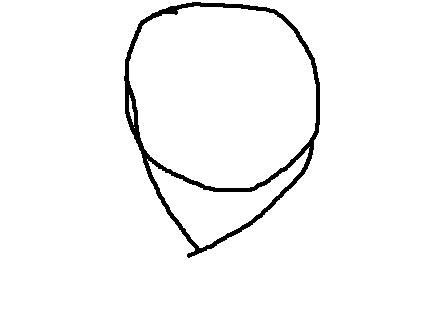
Simple simple. 3 keystrokes. A circle a line going down one end and a line connected the 2nd line to he bottom right part of the circle.
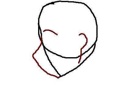
from the 2nd line I went and added a simple nose bridge. Its just an upside down L shape with a bump at the angle point.
added in basic facial features. Once again freehanding it makes it more organic looking. The neck is just two obtuse L shapes.
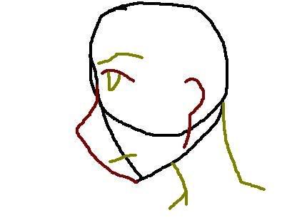
The last but not least, the hair. Everyone in the world has a crown horl (if I spelled it right). Hair should always flow from this point.
Thats about it. From there just colorit in and boom you have a better profile shot. Even though I admit it leaves much to be desired its a simple start in the right direction.
Just being constructive...
_________________
Indy OHR! and National OHR Month Contest going on now!
"Aeth calls PHC an anti-semite; PHC blames anti-semitism"
-squall |
|
| Back to top |
|
|
The Wobbler

Joined: 06 Feb 2003
Posts: 2221
|
| Posted: Thu May 18, 2006 7:07 pm Post subject: |
|
|
| Note from Castle Paradox Administration: | | This content has been removed by the user. Contact the original author and link them to this post if you wish to view the original content. Only the author can remove the tags hiding this content. |
|
|
| Back to top |
|
|
Ysoft_Entertainment
VB Programmer
Joined: 23 Sep 2003
Posts: 810
Location: Wherever There is a good game.
|
| Posted: Thu May 18, 2006 10:35 pm Post subject: |
|
|
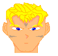
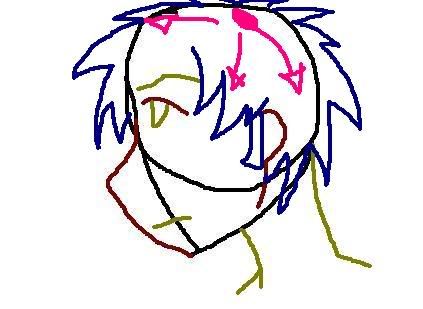
Here is the next face

Did I at least get the anatomy right? what do you think?
This time I didn't use line tool, this was done 100% with a pencil tool.
and phc: trust me I draw worse then my 6 year old sis with a pencil.
_________________
Try my OHR exporter/importer.
OHRGFX
Striving to become better pixel artist then Fenrir Lunaris. Unfortunately the laziness gets in the way of my goals. |
|
| Back to top |
|
|
Gizmog1
Don't Lurk In The Bushes!
Joined: 05 Mar 2003
Posts: 2257
Location: Lurking In The Bushes!
|
| Posted: Thu May 18, 2006 11:11 pm Post subject: |
|
|
His nose is really off center, and curved at kind of a bizarre angle. The eyes also seem kind of far apart and narrow, which makes him look mentally challenged. His ear looks like it's stapled to the back of his head, and even though his head is canted to the left, all of his hair is stuck, glued right to his scalp. Hell, it looks like the one strand is actually going UP his face.
His neck is a little bit wide, and isn't at the right angle it should be for where his head is. It looks like someone broke his neck and jaw, and it's just sitting there resting on what bone there is in the back. His shirt's also pretty straight, a little bit of a collar might help separate it. And, I also personally wouldn't have added the line to his neck, and if I did, I wouldn't have made it so low. That's actually close though, it just needs to be a little higher.
Just keep practicing Ysoft, you'll get it eventually. Do you mind if I ask why you're aiming for genericism, instead of adapting a style that comes more naturally to you, and which you might have more success with? |
|
| Back to top |
|
|
Ysoft_Entertainment
VB Programmer
Joined: 23 Sep 2003
Posts: 810
Location: Wherever There is a good game.
|
| Posted: Fri May 19, 2006 6:05 am Post subject: |
|
|
Actually by learning the generic style, I am hoping that once I do, I will be able to come up with my own style afterwards.
Thanks for your creativer critisism Giz, I appreaciate it.
_________________
Try my OHR exporter/importer.
OHRGFX
Striving to become better pixel artist then Fenrir Lunaris. Unfortunately the laziness gets in the way of my goals. |
|
| Back to top |
|
|
Gizmog1
Don't Lurk In The Bushes!
Joined: 05 Mar 2003
Posts: 2257
Location: Lurking In The Bushes!
|
| Posted: Fri May 19, 2006 7:53 am Post subject: |
|
|
| Ysoft, by definition, Generic isn't a style, it's a total lack thereof. If you want my advice, I'd suggest you look at something for a few minutes, and then hide it somewhere, and try to draw it from memory, just however works best for you. Just doing it generic could get to be a bad crutch for you eventually. It's not bad when you're starting, maybe, but once you've got the basics, you should really try to develop your own style, just so that later on if you ever decide generic isn't really working out for you, you haven't gotten to a point where you don't know what to do without it. |
|
| Back to top |
|
|
Shaede
Tuck in your shirt.

Joined: 08 Jan 2004
Posts: 107
|
| Posted: Fri May 19, 2006 11:25 am Post subject: |
|
|
Style is developed once you learn and understand all the ins and outs of the technique of the art medium you are using. It's something that's not immediatly slapped together unskillfully, but a tool used to express or show something in a way true to your own self. You want an example of style?
Here's one of the most revolutionary stylistic works of art ever created:

This is different from someone who is simply unpracticed. Learn the basics, follow the paved road that others have made for you over the centuries, then branch out on your own path if you think you're talented or creative enough to do so. Once you understand what you're doing, you can branch away from reality a little and still project what you're aiming to without it looking deformed and sloppy. |
|
| Back to top |
|
|
Onlyoneinall
Bug finder
Joined: 16 Jul 2005
Posts: 746
|
| Posted: Fri May 19, 2006 4:17 pm Post subject: |
|
|
| Ysoft_Entertainment wrote: | Here is the next face
Did I at least get the anatomy right? what do you think?
This time I didn't use line tool, this was done 100% with a pencil tool.
and phc: trust me I draw worse then my 6 year old sis with a pencil. |
No offense, but this looks like the way I used to draw when I was 12. By 13 it was looking more like what Battleblaze showed.
YSoft - I suggest you take a picture of yourself and try to draw it as close to it as possible as you can get. The way I got better was using my own anatomy (ie - hands, face, hair) in different positions and what not. Forget How to Draw Manga books or drawing generically - the only time I ever looked at one was to see if I could get a better understanding of drawing hands or feet, but it's really really not necessary. I've seen guys and girls who draw anime style, or manga - whatever you want to call it. The guys draw pictures that look like yours and the ones that have any art skill draw pictures that have no unique look to it. I only know one girl that has a lot of skill and a unique look with anime, but she is also a creative person.
What I'm getting at is learn on your own, at least that's what worked best for me. Pick up tips here and there but don't get a full on tutorial because you don't really need it.
_________________
http://www.castleparadox.com/gamelist-display.php?game=750 Bloodlust Demo 1.00
 |
|
| Back to top |
|
|
LongeBane

Joined: 03 Feb 2003
Posts: 312
Location: Tomorrow
|
| Posted: Fri May 19, 2006 5:54 pm Post subject: |
|
|
I agree with xerian on the most part. He seems to have found his own style without heavy traces of manga in it. You can just look at one of his drawings and you immediately know its by him.
Another thing is, the last few face pics you made, they don't even look manga styled. Heres a nice example of a sort of stylish work done here at cp by mewmew.
 |
|
| Back to top |
|
|
|

