| View previous topic :: View next topic |
| Author |
Message |
hermitmage

Joined: 24 Jul 2006
Posts: 2
Location: BC, Canada
|
 Posted: Mon Jul 24, 2006 6:10 pm Post subject: Graphics Tips Posted: Mon Jul 24, 2006 6:10 pm Post subject: Graphics Tips |
 |
|
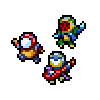
Any tips on character graphic design?
This includes enemies, npcs, heroes, etc.
Thanks,
Hermitmage |
|
| Back to top |
|
 |
Skoll

Joined: 10 Jul 2006
Posts: 3
|
| Posted: Mon Jul 24, 2006 6:18 pm Post subject: |
|
|
I may not be at liberty to give graphical advice 
But everything looks better shaded, and one-color tiles are boring. That's pretty much all I got...
_________________
Metal Lotus Demo
Dance water, Dance! |
|
| Back to top |
|
|
JSH357

Joined: 02 Feb 2003
Posts: 1705
|
|
| Back to top |
|
|
Battleblaze
Warrior Thread Monk

Joined: 19 Dec 2003
Posts: 782
Location: IndY OHR
|
| Posted: Mon Jul 24, 2006 10:37 pm Post subject: |
|
|
Sweet lord JSH have you been holding out ona brotha!?
Hermy...Ur sig is scaring me. Are you a dumb human or an incredible hyper advertising bot?
_________________
Indy OHR! and National OHR Month Contest going on now!
"Aeth calls PHC an anti-semite; PHC blames anti-semitism"
-squall |
|
| Back to top |
|
|
TwinHamster
♫ Furious souls, burn eternally! ♫
Joined: 07 Mar 2004
Posts: 1352
|
| Posted: Tue Jul 25, 2006 4:53 am Post subject: |
|
|
| There's a big collection at the 'articles' page. |
|
| Back to top |
|
|
Valigarmander
Bye-Bye

Joined: 04 Mar 2006
Posts: 750
Location: Nowhere
|
| Posted: Tue Jul 25, 2006 5:34 am Post subject: |
|
|
| Yeah, there's a bundle of crap at the articles page. But some advice from me: don't be boring. Add a little variety to your graphics. Make the NPCs a little more varied. Give little quirks to your maptiles, like a crack in the floor or a torch on the wall. Every little thing helps. |
|
| Back to top |
|
|
Valkyrie

Joined: 17 Jul 2006
Posts: 11
Location: England
|
| Posted: Tue Jul 25, 2006 6:05 am Post subject: |
|
|
And with maptiles - if you can make it animated, do so, it adds so much more depth and just looks better.
Like with fire, and wall torches and all that. Try to give them depth - use different shades. Around those wall torches, make the surrounding area illuminate.
Don't use colours that clash - stick to an overall colour scheme, and don't sway from that. For instance, Tilde and the Mask of P uses a custom palette of colours that all match - colours are the most important thing.
As for anything else, check those articles that JSH said - they have a tonne of useful info, and Rinku is far better at spriting than I am.
_________________
Ollan hiljaa, saadaan kaloja. |
|
| Back to top |
|
|
|

