| View previous topic :: View next topic |
| Author |
Message |
Moogle1
Scourge of the Seas
Halloween 2006 Creativity Winner


Joined: 15 Jul 2004
Posts: 3377
Location: Seattle, WA
|
 Posted: Fri May 30, 2008 12:37 pm Post subject: Fonts for YOU Posted: Fri May 30, 2008 12:37 pm Post subject: Fonts for YOU |
 |
|
http://gilgamesh.hamsterrepublic.com/wiki/ohrrpgce/index.php/Where_can_I_find_fonts%3F
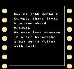
I just uploaded three fonts I made. Hopefully someone will find these useful! They are yours to use for free.
If you have a font that you'd like to put up on the wiki but you don't have hosting for it, let me know and we can make arrangements. I like having these sorts of resources available.
_________________
|
|
| Back to top |
|
 |
Rya.Reisender
Snippy

Joined: 18 Jan 2008
Posts: 821
|
 Posted: Fri May 30, 2008 12:43 pm Post subject: Posted: Fri May 30, 2008 12:43 pm Post subject: |
 |
|
I personally always am annoyed by custom fonts in OHRRPGs because they are usually hard to read.
_________________
Snippy:
"curt or sharp, esp. in a condescending way" (Oxford American Dictionary)
"fault-finding, snappish, sharp" (Concise Oxford Dictionary, UK)
1. short-tempered, snappish, 2. unduly brief or curt (Merriam-Webster Dictionary) |
|
| Back to top |
|
 |
Moogle1
Scourge of the Seas
Halloween 2006 Creativity Winner


Joined: 15 Jul 2004
Posts: 3377
Location: Seattle, WA
|
 Posted: Fri May 30, 2008 12:47 pm Post subject: Posted: Fri May 30, 2008 12:47 pm Post subject: |
 |
|
That's... nice.
Edit: just so this has a chance of being a productive conversation, which of those fonts do you find hard to read?
_________________
|
|
| Back to top |
|
 |
Rya.Reisender
Snippy

Joined: 18 Jan 2008
Posts: 821
|
 Posted: Sat May 31, 2008 5:03 am Post subject: Posted: Sat May 31, 2008 5:03 am Post subject: |
 |
|
I found it hard to read in all OHR games that used a custom font even those I worked on myself (but wasn't involved in the font). Basically I remember FUABMX (the version with the custom font), EOTE2 and Sword of Jade. All hard to read. ^^'
And I think the ones you posted are hard to read too, I mean the NES one is actually okay, but the caps lock only makes it harder to read again. 
_________________
Snippy:
"curt or sharp, esp. in a condescending way" (Oxford American Dictionary)
"fault-finding, snappish, sharp" (Concise Oxford Dictionary, UK)
1. short-tempered, snappish, 2. unduly brief or curt (Merriam-Webster Dictionary) |
|
| Back to top |
|
 |
The Drizzle
Who is the Drizzle?

Joined: 12 Nov 2003
Posts: 432
|
 Posted: Sat May 31, 2008 10:39 am Post subject: Posted: Sat May 31, 2008 10:39 am Post subject: |
 |
|
I agree with Rya in this situation. Custom fonts do nothing but slow down your reading speed and just cause general frustration. It's a principle of typography that blocks of text should be simple sans serif fonts to be effectively read without annoying the hell out of the reader. Complex fonts should be reserved for short titles. It doesn't even have to be that they're super difficult to read. Just slightly harder and significantly more annoying.
_________________
My name is...
The shake-zula, the mic rulah, the old schoola, you wanna trip? I'll bring it to yah... |
|
| Back to top |
|
 |
Newbie_Power

Joined: 04 Sep 2006
Posts: 1762
|
 Posted: Sat May 31, 2008 11:12 am Post subject: Posted: Sat May 31, 2008 11:12 am Post subject: |
 |
|
The NES font would look great to replace the capitals, but keep the lowercase letters. The Scary font would make an awesome italics addition.
_________________

TheGiz> Am I the only one who likes to imagine that Elijah Wood's character in Back to the Future 2, the kid at the Wild Gunman machine in the Cafe 80's, is some future descendant of the AVGN? |
|
| Back to top |
|
 |
Moogle1
Scourge of the Seas
Halloween 2006 Creativity Winner


Joined: 15 Jul 2004
Posts: 3377
Location: Seattle, WA
|
 Posted: Sun Jun 01, 2008 2:44 pm Post subject: Posted: Sun Jun 01, 2008 2:44 pm Post subject: |
 |
|
 
Tell me that would look as good with a standard font. (Hint: it wouldn't and you are lying to yourself)
If your game is a long RPG with lots of text, I agree. Your font should be optimized for readability. If it's a shorter game with less text (such as Castlevania or most other NES titles), who cares if it takes you 10 seconds instead of 7 to read the text box?
Or, to use a different approach, why aren't you all using Arial for your title screens? It's much easier to read, you know. The point is, sometimes you use a different font because it fits your game better.
_________________
|
|
| Back to top |
|
 |
The Drizzle
Who is the Drizzle?

Joined: 12 Nov 2003
Posts: 432
|
 Posted: Sun Jun 01, 2008 3:30 pm Post subject: Posted: Sun Jun 01, 2008 3:30 pm Post subject: |
 |
|
| Quote: | | Or, to use a different approach, why aren't you all using Arial for your title screens? It's much easier to read, you know. The point is, sometimes you use a different font because it fits your game better. |
Because titles are really big and much easier to read. I do agree with you though that in cases with very little text in total in the game, or if what you read isn't really all that important, then who cares.
_________________
My name is...
The shake-zula, the mic rulah, the old schoola, you wanna trip? I'll bring it to yah... |
|
| Back to top |
|
 |
Newbie_Power

Joined: 04 Sep 2006
Posts: 1762
|
 Posted: Sun Jun 01, 2008 3:40 pm Post subject: Posted: Sun Jun 01, 2008 3:40 pm Post subject: |
 |
|
| Quote: | | Tell me that would look as good with a standard font. (Hint: it wouldn't and you are lying to yourself) |
Huh? I thought everyone agreed the CVIII would be hard to read if used as the standard. If your comment was directed at me, I was referring to the "Scary Font" as the Scary Game 3 font you made, not the CVIII one.
_________________

TheGiz> Am I the only one who likes to imagine that Elijah Wood's character in Back to the Future 2, the kid at the Wild Gunman machine in the Cafe 80's, is some future descendant of the AVGN? |
|
| Back to top |
|
 |
Moogle1
Scourge of the Seas
Halloween 2006 Creativity Winner


Joined: 15 Jul 2004
Posts: 3377
Location: Seattle, WA
|
 Posted: Sun Jun 01, 2008 4:26 pm Post subject: Posted: Sun Jun 01, 2008 4:26 pm Post subject: |
 |
|
Ah, no, I wasn't talking to you specifically. CV3's font isn't the most readable, but the game wouldn't have felt the same if it had used a standard font.
There are fonts that aren't the default font AND aren't hard to read, though. Slight alterations to the default font are more distracting than anything, but giving your game a different readable font can make it look distinctive. IIRC Missing had a custom font.
_________________
|
|
| Back to top |
|
 |
Newbie_Power

Joined: 04 Sep 2006
Posts: 1762
|
 Posted: Sun Jun 01, 2008 4:39 pm Post subject: Posted: Sun Jun 01, 2008 4:39 pm Post subject: |
 |
|
Anyway, I just realized that a solution to the NES font lacking lower case letters would be to take them from a game with a terrible password system, such as Metroid. If you do that, then the NES font becomes the most unreadable of the three, heh.
_________________

TheGiz> Am I the only one who likes to imagine that Elijah Wood's character in Back to the Future 2, the kid at the Wild Gunman machine in the Cafe 80's, is some future descendant of the AVGN? |
|
| Back to top |
|
 |
|


