| View previous topic :: View next topic |
| Author |
Message |
TwinHamster
♫ Furious souls, burn eternally! ♫
Joined: 07 Mar 2004
Posts: 1352
|
 Posted: Mon Feb 04, 2008 3:14 pm Post subject: Posted: Mon Feb 04, 2008 3:14 pm Post subject: |
 |
|
| Moogle1 wrote: | | The menu colors are striking and lend the game a nice touch. The updated walkabout colors are a bit too bright for the rest of the game. |
I haven't even toughed UI colors yet.
The font color came with the palette import, but thanks!
I guess I'll keep that the way it is :p
Also, with the palette in its current state, I'm afraid that anything darker would blend the characters into the background too much.
If this turns out to be a problem, I'll fix this promptly.
| Newbie Power wrote: |
I envy your ability to be productive |
You should use a journal! |
|
| Back to top |
|
 |
Newbie_Power

Joined: 04 Sep 2006
Posts: 1762
|
| Posted: Mon Feb 04, 2008 3:59 pm Post subject: |
|
|
| Quote: | | You should use a journal! |
I already tried. I ended up getting more stuck than getting somewhere, heh.
_________________

TheGiz> Am I the only one who likes to imagine that Elijah Wood's character in Back to the Future 2, the kid at the Wild Gunman machine in the Cafe 80's, is some future descendant of the AVGN? |
|
| Back to top |
|
|
Rya.Reisender
Snippy

Joined: 18 Jan 2008
Posts: 821
|
| Posted: Tue Feb 05, 2008 4:57 am Post subject: |
|
|
Light sprites on dark maptiles isn't really that bad, Moogle. Some games do it intentionally (SaGaFrontier 1) and it looks cool.
I like the graphics a lot, especially the maptiles. Something bugs me about the character sprites, especially in battles, though. I think it's because you alternate between a "light" and a "dark" version of a color and the brightness different is quite high and the direct alternating makes it look a bit checky (chess-like). At least it seems like that from the screenshots. Maybe add a small random factor to the dark/bright alternation and maybe reduce the brightness gap? Just some thoughts.
Oh also I hope you finish that game because it looks promising. =)
Edit: Looking at the screenshots with a large zoom actually makes me realize it's not the shading that make it looks checky but more the outlines that are put in an unfortunate way, so when you see it in small it looks like that. |
|
| Back to top |
|
|
Rya.Reisender
Snippy
Joined: 18 Jan 2008
Posts: 821
|
| Posted: Tue Feb 05, 2008 5:20 am Post subject: |
|
|
Oh yeah, the word Dithering fits too. And maybe even Aliasing.
I think you can see it best with Jonas. If I look at him unzoomed he it almost looks like he has a skeletal body, because the color often jumps from dark to bright and from bright back to dark.
Edit: Huh? Where did your post go? o.o |
|
| Back to top |
|
|
TwinHamster
♫ Furious souls, burn eternally! ♫
Joined: 07 Mar 2004
Posts: 1352
|
| Posted: Tue Feb 05, 2008 5:21 am Post subject: |
|
|
Thanks for your approval.
And I believe that the "checky" quality that you're referring to is the dithering in my sprites.
In pixel-art, you're not supposed to look at sprites through super zooms; therefore, it's okay to trick the viewer's eyes into thinking that there are more colors than there really are (that's what dithering does :p)
But I'm still a bit confused..Would you rather see gradient shading?
[edit] Haha, deleted the post to start it over :D
| Quote: | | I think you can see it best with Jonas. If I look at him unzoomed he it almost looks like he has a skeletal body, because the color often jumps from dark to bright and from bright back to dark. |
Ah, I think I see what you mean.
So the contrast is too large, right?
Jonas' sprites have yet to be updated, so I'm allowed to tell you that he should be okay pretty soon. |
|
| Back to top |
|
|
TwinHamster
♫ Furious souls, burn eternally! ♫
Joined: 07 Mar 2004
Posts: 1352
|
| Posted: Fri Feb 15, 2008 6:59 pm Post subject: |
|
|
Whoops, I haven't done too much more since the last update, but here's a little of what I've got.

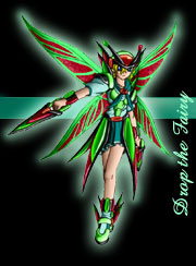
It's Jonas!
Featuring his old costume as well as two potential palettes.
Which one to choose?

Remember the dastardly villain at the end of the first dungeon with three annoying shield-generators hovering around him?
He might look like this now. |
|
| Back to top |
|
|
Newbie_Power
Joined: 04 Sep 2006
Posts: 1762
|
| Posted: Fri Feb 15, 2008 8:06 pm Post subject: |
|
|
Speaking of which... Has that bug been fixed where he would spawn too many shield components, making him nearly impossible to kill?
_________________
TheGiz> Am I the only one who likes to imagine that Elijah Wood's character in Back to the Future 2, the kid at the Wild Gunman machine in the Cafe 80's, is some future descendant of the AVGN? |
|
| Back to top |
|
|
TwinHamster
♫ Furious souls, burn eternally! ♫
Joined: 07 Mar 2004
Posts: 1352
|
| Posted: Fri Feb 15, 2008 10:59 pm Post subject: |
|
|
| Newbie_Power wrote: | | Speaking of which... Has that bug been fixed where he would spawn too many shield components, making him nearly impossible to kill? |
I was never able to reproduce that bug, so rather than trying to fix it, I'm just going to recreate the boss battle altogether.
Surprises are fun, right? |
|
| Back to top |
|
|
Newbie_Power
Joined: 04 Sep 2006
Posts: 1762
|
| Posted: Fri Feb 15, 2008 11:12 pm Post subject: |
|
|
Ah. Judging by the spawning behavior, though, I think the solution would have been to just have some false enemies take up the extra places then have them die when the boss does, but if you can make the boss better, then that's okay too.
_________________
TheGiz> Am I the only one who likes to imagine that Elijah Wood's character in Back to the Future 2, the kid at the Wild Gunman machine in the Cafe 80's, is some future descendant of the AVGN? |
|
| Back to top |
|
|
TwinHamster
♫ Furious souls, burn eternally! ♫
Joined: 07 Mar 2004
Posts: 1352
|
| Posted: Mon Feb 18, 2008 9:28 pm Post subject: |
|
|

Jonas' sprite is done, for now.
I've been playing too much Fire Emblem 6 lately and I've tried to use some of the poses that I've seen.
One of the more awesome things is how little the characters have to move in order to dodge an attack. I've tried to imitate that, but I don't think it turned out too well.. |
|
| Back to top |
|
|
Newbie_Power
Joined: 04 Sep 2006
Posts: 1762
|
| Posted: Mon Feb 18, 2008 10:02 pm Post subject: |
|
|
I know that the GBA Fire Emblem games relied on motion trails to achieve their animation effects.
_________________
TheGiz> Am I the only one who likes to imagine that Elijah Wood's character in Back to the Future 2, the kid at the Wild Gunman machine in the Cafe 80's, is some future descendant of the AVGN? |
|
| Back to top |
|
|
Chenzi
User was banned for this post

Joined: 02 Aug 2003
Posts: 190
Location: Grand Rapids, MI
|
| Posted: Wed Mar 05, 2008 12:32 pm Post subject: |
|
|
It's impressive looking from what you started with to where you are now. I was initially going to reply with "Change the fucking hero graphics and the backdrops", but as of now, I have no gripes.
_________________
Allow me to preemptively disclose that I probably hate the person posting below, including myself. |
|
| Back to top |
|
|
TwinHamster
♫ Furious souls, burn eternally! ♫
Joined: 07 Mar 2004
Posts: 1352
|
| Posted: Wed Jun 25, 2008 10:28 am Post subject: |
|
|
All right, after becoming infuriated with the messes I made in previous reincarnations of Detelamane, I started from scratch at least two more times now.
In each version, I've been adding a modification to the level up system to allow players to have more customization over their characters.
As of now, I've planned out and partly implemented:
Stats being determined determined from equipment:
This takes advantage of the old level-up bug and (hopefully) prevents equipment from becoming too powerful.
Stat Point allocation:
Copied from some western MMO systems where you are given some points to spend towards your character stats.
This should help compensate for character weaknesses, but I'd rather not give enough to make everything a character strength.
Job Advancement:
Heavily influenced by Fire Emblem and Pokemon.
At certain levels, characters will be given a choice to branch off of their job into one of two sub-groups. I'm hoping for each character to gain at least two class promotions. And no Pushing-B allowed, kiddies.
I'm still having some trouble with balancing issues with a few classes, but more on that later.
Speed:
I want equipment to give characters some points in speed, but I don't want people having insanely high speed values either, so I've been playing with a Instead-Of-Battle script that scales the hero's speed to a more reasonable value before the fight.
I'm also redoing all of the graphics for the game (I've had trouble with pixels ever since the good folks at Pixelation gave me a spanking) and tweaking the storyline (So sorry none of it was actually told in the previous demo)
Good things are coming in the next month. |
|
| Back to top |
|
|
TwinHamster
♫ Furious souls, burn eternally! ♫
Joined: 07 Mar 2004
Posts: 1352
|
| Posted: Sun Jun 29, 2008 4:00 pm Post subject: |
|
|

This is Den.
He's got a stylish new mask, some pretty neat gloves, and a new air of dignity about him.
There are still a few outlining-issues and sel-out to fix, but I've decided that most of his form is complete. |
|
| Back to top |
|
|
Newbie_Power
Joined: 04 Sep 2006
Posts: 1762
|
| Posted: Sun Jun 29, 2008 5:46 pm Post subject: |
|
|
Freaking awesome. Den is far more readable than previous versions.
Selout? I don't see any selout, or are you planning on adding some? If you're planning on Capcom's selout where they break outlines, don't add that. It's ugly, and not worth it for small sprites. If you're going to color the outline based on shape and light source, that's perfectly fine.
_________________
TheGiz> Am I the only one who likes to imagine that Elijah Wood's character in Back to the Future 2, the kid at the Wild Gunman machine in the Cafe 80's, is some future descendant of the AVGN? |
|
| Back to top |
|
|
|