| View previous topic :: View next topic |
| Author |
Message |
The Wobbler

Joined: 06 Feb 2003
Posts: 2221
|
 Posted: Wed Aug 31, 2005 11:20 pm Post subject: My eyes are bleeding. Posted: Wed Aug 31, 2005 11:20 pm Post subject: My eyes are bleeding. |
 |
|
| Note from Castle Paradox Administration: | | This content has been removed by the user. Contact the original author and link them to this post if you wish to view the original content. Only the author can remove the tags hiding this content. |
|
|
| Back to top |
|
 |
Iblis
Ghost Cat

Joined: 26 May 2003
Posts: 1233
Location: Your brain
|
| Posted: Wed Aug 31, 2005 11:35 pm Post subject: |
|
|
I haven't had trouble reading anything, but the colors are indeed very ugly. I didn't have that much of a problem with the blue, the orange, or the cyan, but this is just awful.
_________________
Locked
OHR Piano |
|
| Back to top |
|
|
The Wobbler
Joined: 06 Feb 2003
Posts: 2221
|
| Posted: Wed Aug 31, 2005 11:49 pm Post subject: |
|
|
| Note from Castle Paradox Administration: | | This content has been removed by the user. Contact the original author and link them to this post if you wish to view the original content. Only the author can remove the tags hiding this content. |
|
|
| Back to top |
|
|
Inferior Minion
Metric Ruler

Joined: 03 Jan 2003
Posts: 741
Location: Santa Barbara, CA
|
| Posted: Wed Aug 31, 2005 11:50 pm Post subject: |
|
|
Honestly....this theme sucks and I'm the only one to blame for it. For all the themes, I started with the character's base color (in this case purple) and grabbed different shades for the different columns. I then went back to the character and grabbed a second color for the border and header (in this case that awful red). I tried the pink. I tried the blue, I tried the orange, and I even tried the white of her hair. Couldn't find anything that went remotely well with this color. I still have the google ads set to use the blue from another theme.
The colors are easily fixed if you give me a few suggestions. From my count, there are 7 colors (When viewed from the viewjournal page):
1) Base & Topic Row
2) Replies & Views
3) Author & Last Post
4) Border & Headers
5) Text
6) Links
7) Background Color (The little lines running through everything/the bottom of th page)
I'm more than willing to try new colors out. Just give me 7 colors you think work better.
_________________
|
|
| Back to top |
|
|
Iblis
Ghost Cat
Joined: 26 May 2003
Posts: 1233
Location: Your brain
|
| Posted: Thu Sep 01, 2005 12:09 am Post subject: |
|
|
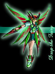
Well, really I would recommend NOT basing the website colors off of outrageously gawdy anime characters. I don't think I could pick any colors from that drawing that would look good on the site.
Don't design a theme around a drawing, design a good theme and then if you want get someone to draw a picture that fits. It's more important that the theme looks good than that it matches the mascot.
If you wanted to still do the purple thing for this day, I'd say make the text darker, make the window color lighter and less saturated, and replace that red with either a dark blue or dark purple.
_________________
Locked
OHR Piano |
|
| Back to top |
|
|
The Wobbler
Joined: 06 Feb 2003
Posts: 2221
|
| Posted: Thu Sep 01, 2005 12:26 am Post subject: |
|
|
| Note from Castle Paradox Administration: | | This content has been removed by the user. Contact the original author and link them to this post if you wish to view the original content. Only the author can remove the tags hiding this content. |
|
|
| Back to top |
|
|
Iblis
Ghost Cat
Joined: 26 May 2003
Posts: 1233
Location: Your brain
|
| Posted: Fri Sep 02, 2005 12:12 am Post subject: |
|
|
IM: Fortis wrote some helpful words on this subject that I think you should seriously consider.
"An interface, that is, a website, document, computer GUI, ATM panel, whatever, should rely on a neutral color accented by secondary non-neutral colors. Case in point: black and grey, neutrals, accented by emerald green, a non-neutral. The best computer interfaces are grey accented by another color, too. Even DOS is black and grey, and maybe green or amber depending.
Note that other neutral colors include washed-out non-neutrals. A greyed blue would be fine. I suppose I should also elaborate by saying that accents are NOT where the content, at least not the BULK of it, goes. The posts are backed by purple today, tomorrow will be vomit green or whatever, who cares, the point is the main content isn't on a neutral color and is hard to look at."
_________________
Locked
OHR Piano |
|
| Back to top |
|
|
Gizmog1
Don't Lurk In The Bushes!
Joined: 05 Mar 2003
Posts: 2257
Location: Lurking In The Bushes!
|
| Posted: Fri Sep 02, 2005 1:13 am Post subject: |
|
|
| I personally always like rigging my HSpeak Editor to have the scheme of a chalkboard. Kind of a slate green with gray or white text. |
|
| Back to top |
|
|
Machu
Righter, a person who rights wrongs

Joined: 09 Jul 2003
Posts: 737
|
| Posted: Fri Sep 02, 2005 1:36 am Post subject: |
|
|
 : "Y'know, guys, I did win 2nd prize in a beauty pageant. : "Y'know, guys, I did win 2nd prize in a beauty pageant.
Also, put on a shirt, girl, or I'LL RIP YOU!"
_________________
| Code: | [*]That's it
[*]I'm done reasoning with you
[*]Starting now, there's going to be a lot less conversation and a lot more killing |
|
|
| Back to top |
|
|
TMC
On the Verge of Insanity
Joined: 05 Apr 2003
Posts: 3240
Location: Matakana
|
| Posted: Fri Sep 02, 2005 1:53 am Post subject: |
|
|
Prehaps if you used a unsaturated shade of white or grey of colours from the mascot, rather than fully saturated. I personally don't mind reading on them, though the site is shocking every day I load it.
_________________
"It is so great it is insanely great." |
|
| Back to top |
|
|
|